Reply With Quote
Looks like a good start Santo. What resolution are you working at currently?

 Senior Member

Hi All
this is my new project... is not finish yet...
Super Moderator
Looks like a good start Santo. What resolution are you working at currently?
Click my signature picture to visit my site showing my profiles
Senior Member
thank you for your comment Supah
at this moment I use 4961*1812 A3 format 300dpi for this draw
Regards
Santino
Super Moderator
The panellines look a bit big for that resolution
Click my signature picture to visit my site showing my profiles
Senior Member
I use 3 px brush for make the pannel lines meybe with blending option - bevel and emboss on the layer
Senior Member
I started with 3 px panel lines also but have gone to 2px and now 1 px. For this drawing, you might want to set the opacity to a lower level, to "hide" the panel lines a bit. It doesn't matter as much on a camouflaged a/c but a natural metal one shows the lines more. Nice work aside from that. Look forward to seeing more.
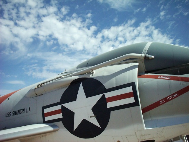
Just another question: above your signature is a white mark (hole) on the fuselage, just below the wingtip. Is that normal? I don't know the Demon, so I'm just wondering.
Last edited by gamary; 29th April 2007 at 17:33.
Grand Wazoo
Supah has a good point. But what you do depends on the look you want. What you have now is a very nice color technical illustration. Maybe the lines could be smaller but this would depend on how you'd like it to look. If you want a more racialistic look, less like a technical drawing and more like a photo, you would definitely want thinner panel lines.
My answer is always go back to the photo reference and see what the real thing looks like-
That is, if you want a realistic look
If you haven't seen this, you'll want to check out these nice photos-
F3H Demon Airframe In Detail by Fotios Rouch
FAST AND BULBOUS!
Senior Member
thank you for your suggestion gamary & BLOWHARD
I just change pannel lines with 1 px brush, I hope now the aircraft look better, I already Know that website, first to begin this aircraft I search all the info and foto about this plane
I need help about the stencil, if someone can help me thanks
Super Moderator
Wow very usefull link bibbolicious !
Click my signature picture to visit my site showing my profiles
 Posting Permissions