
-
3rd November 2008, 01:43
#1
Traditional Painting with Digital Media
By adlabs6
11/02/08
Introduction
My first experiences with digital media painting were with ?Dabbler? from Fractal Design, running on a 486 CPU with 8MB of RAM. This program simulated a variety of real world natural media art supplies, as well as papers of varying textures. The work space was designed around the concept of working with the actual type of pen, marker, brushes, or other tools directly on the paper, with each stroke interacting not only with the paper, but other media which had been previously applied.
Moving through the years, my interests and needs outgrew what this type of program offered. I wanted layers, effects, and the stronger photographic editing power of the more advanced imaging software packages. What I found was missing from these packages, was the simulated interactions between the media with the canvas (which was now simply a texture-less white square) and interactions with other media already applied to the canvas. The results of dragging a brush across the canvas in Photoshop, Paint hop Pro, or Gimp may be less visually exciting than the results a natural media program creates, but the tools provide vast creative options.
Experimenting with these applications, I focussed on a few techniques for creating shape, form, shading, and texture manually. These are very straightforward, and I use them for any kind of subject, as you will see in the painting section of this tutorial.
Techniques Compared to Skinning and Profiling
In general the techniques and working methods for a traditional painting style have much in common with those used in creating skins for simulations, as well as profile illustrations. We need to define shape and form, and finalize details with texture and shading. I'll detail my methods for this later on. If you are reasonably experienced with either skinning or profiling, you should be well equipped to begin successfully exploring traditional painting with digital media.
Before The Paint: The Base Sketch
When I begin a new painting, I usually start with a simple sketch. For this sketch I may use either digital tools, or plain paper and pencil. Why would I include natural media sketching discussion in an article about digital media painting? In my own view, I consider the sketch a separate artwork from the painting. It is a vastly more free-form and spontaneous creation, one which may begin away from the computer, on the corner of a notebook page, for example. However the idea first comes to life, does not matter.
When creating a sketch with digital media, I prefer the brush tool with a 1 or 2 pixel round tip. Used with my Wacom Graphire 2, this gives me a very natural pencil drawing feeling. When building up my sketch I will use several layers, especially when one component may be affected by another part of the drawing, or when I'd like to experiment with several approaches to an area of the drawing. Often this will leave me with ten or twenty layers, and before moving to my actual working file for my painting, I will export a flattened image of the sketch which I use as my guide.
When I sketch on paper, I use a pencil and work lightly. This allows many changes while keeping the paper quite clean for scanning. Scanning my sketches is done at a moderate resolution, such as 300 dpi, since I do not sketch fine details most of the time. Once in my graphics software, I will adjust brightness or contrast so that I have a clean foundation, but light enough that the sketch does not visually dominate my work space.
In either case, I do not consider my sketch to be definitive while painting. Flexibility is very important.
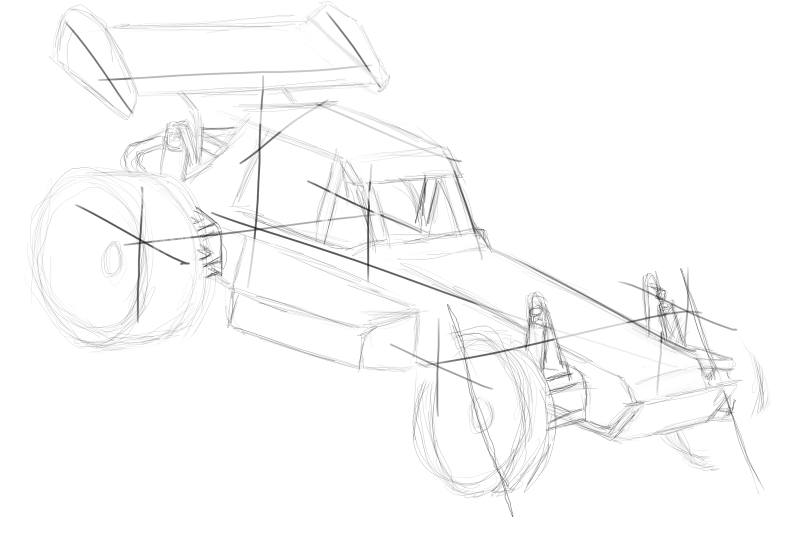
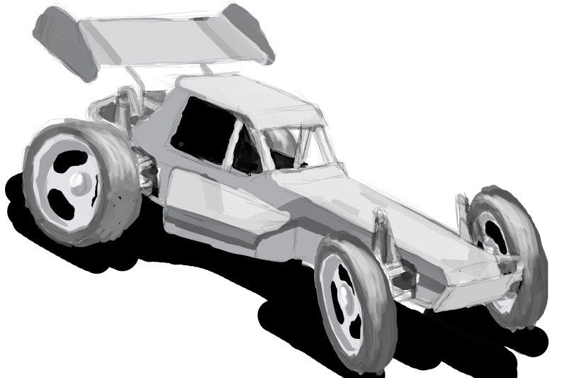
Here are examples of sketches I have created. First is an offroad buggy, sketched with a Wacom in GIMP.
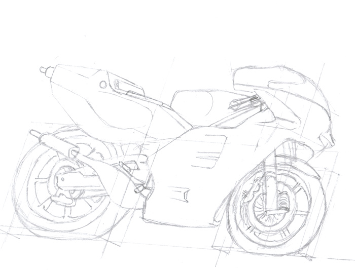
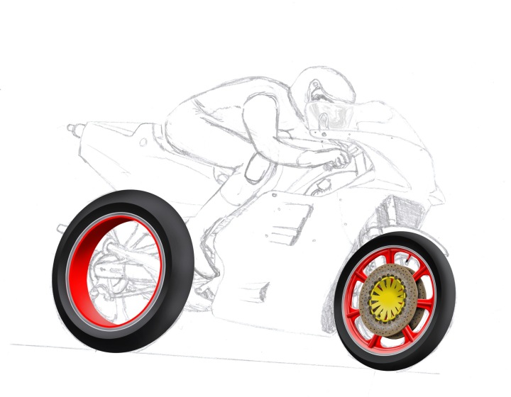
Here is a pen and paper sketch of a motorbike:
Refining the Sketch
After I am satisfied that my work so far will meet my desires, I will probably want to refine the sketch into a more complete form. I can do this several ways, such as by detailing with more pencil strokes, redrawing some problem areas, or shading the drawing to better establish the form.
In the case of the motorbike sketch example, I did not like the perspective work I had in my initial sketch. So I decided to do a complete redraw. This was a pencil and paper drawing, so I used a new sheet of paper over my original sketch to help with the basic proportions. After getting a better perspective foundation, I added more pencil detailing to complete the drawing.
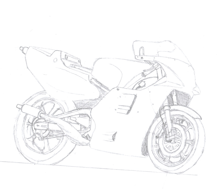
Below are the results, first the refined bike drawing:
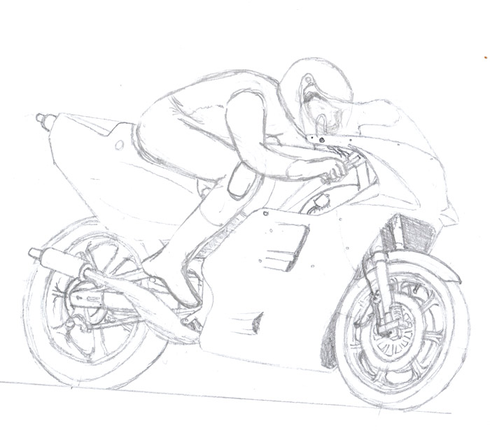
And here is the bike with a rider added. I drew him on a new sheet of paper, laid over the drawing above with the aid of a lightbox. This way I could ensure that he fit the bike perfectly. To place the rider on the bike as shown below, I scanned both pieces of art, and composited the two in Gimp.
Looking at the offroad buggy example from the last section, I felt this sketch was a good enough starting point as it was. I did want to see how this drawing would fill out with shading, though, so I used Gimp to establish a rough painting. You will notice that I made some changes during painting, the front wheels are now turned, and I've added further detailing that wasn't in the original sketch. This was all done with a brush tool in Gimp, varying brush sizes, cool tone gray colors, and black for shadow.
The Paint: Digital Media Painting Techniques
Once the fundamentals of the artwork are established within the sketch, it's time to move to discussion of the actual techniques that can be used during the painting itself. Generally I will follow the working process of establishing the form of the subject, followed by detail shading and creating texture effects. Each of these steps will be covered separately below.
Form
Any subject we paint will have a specific form on the canvas. This refers to the subject boundary area, determined by the subject itself and it's perspective in the artwork, as well as the broader shading effects which establish the shape of the subject.
Form Using Selections
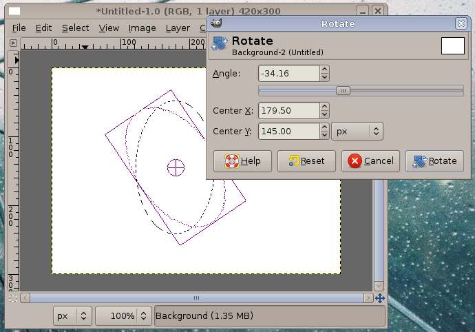
For subjects which require a defined boundary, selections can be used to control the flow of paint within the desired form. The rectangular and elliptical selection tools are quite useful, and both can be further adapted to the subject requirements by using the selection rotation, sheer, and perspective tools some graphics applications offer. Here in the Gimp, I am rotating an elliptical selection.
I rarely make use of other selection tools such like 'foreground select' or 'freehand select' during painting. An exception could be the 'select by color' tools, in case I wanted to select an area of color I've applied and want to shade it. Though again, since this is a painting, I would have complete control of the colors going into the art at every stage, as well as they layers they are on.
Saving Selections
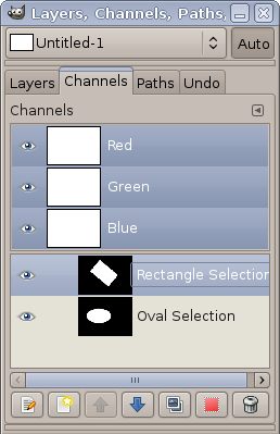
Remember that you can save selections in many graphics applications. This can not only save you the time of reselecting a dropped selection, but it will ensure that each time the selection is used, it's shape is always identical. Here in the Gimp, each of my saved selections are shown on separately named layers in their own tab. Using the buttons on the window, I can select and apply any of these selections easily.
Form Using Paths
Paths are a very valuable and flexible tool. Their shapes can be very carefully controlled, they can be easily duplicated and edited, and as vector graphics they are independent of the artwork resolution. Further, since most graphics applications which have paths allow them to be managed in a layer stack, they are easy to save and find. Any time you have an area that you might use the freehand selection tool, certainly take a moment to consider whether using paths might be easier and more flexible.
Once a path has been created, it can then be converted to a selection using the button on the paths layer stack window. From here it's much the same as working with ordinary selections. Each reapplication of a selection based on a path will be identical.
A technical discussion of working with paths is outside this article's scope. For more information on these topics, look at the following tutorials in the Simmer's Paint Shop library:
Gimp
http://www.simmerspaintshop.com/foru...ead.php?t=1084
Stroked Paths in Gimp
http://www.simmerspaintshop.com/foru...ead.php?t=2055
Photoshop
http://www.simmerspaintshop.com/foru...ead.php?t=1651
Shading
Once the basic form of the subject is established, the shape needs to be further refined by shading. Adding highlighting and shadowing to appropriate areas and in appropriate strengths can be done in broad, general applications, or in more carefully controlled detailing. There are two methods I frequently use for shading, which I will cover separately below.
Free Brushing
Free brushing simply refers to painting with the brush tool directly onto the layer, with no masking or other tools to control the flow of color. This is the same technique used when creating sketches. I use this method when I want to establish large fields of color, define organic shapes, or when making wide shading passes (most frequently used on a layer below the one containing the object). Some example subjects include backgrounds, sky, shadow effects under or behind parts of the painting. Remember to make use of the ?Preserve Layer Transparency? option when using free brush shading. This allows quick and easy brush strokes to 'shade' a layer contents into the painting, without having to do complex selections.
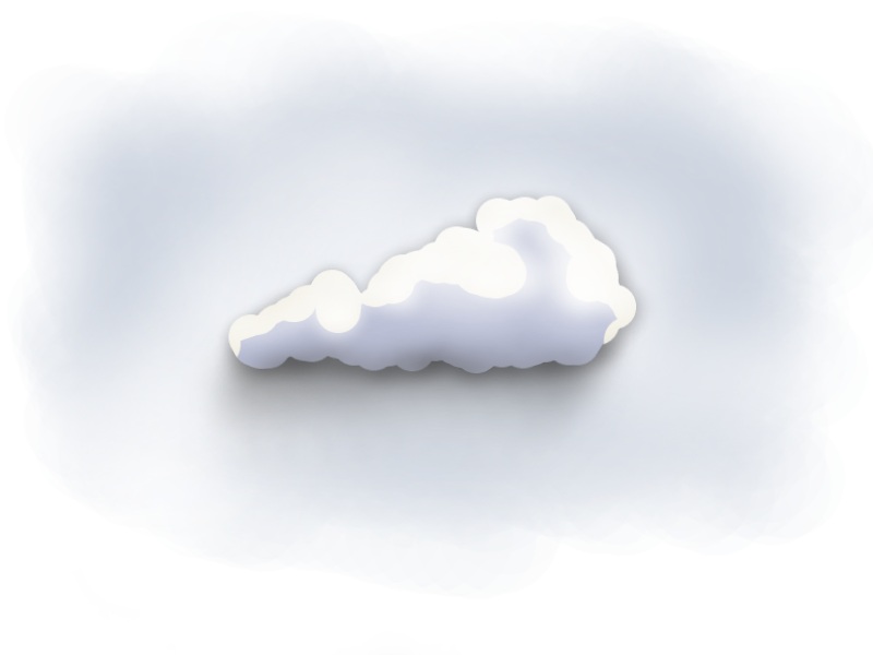
In this example, I have used a wide airbrush to form the sky background. On a new layer, I have used a narrower brush with a smaller feather to create the white cloud puff. Behind the cloud, another layer, this with a faint bit of dark gray brushed around the edge and to the bottom of the cloud shape to give the shadow effect. Each of these three layers are shown below the large image below, left to right: sky background, cloud (checker board is Gimp showing no other layers active), and the cloud shadow (shown on the sky background for easier viewing).

Masked Brushing
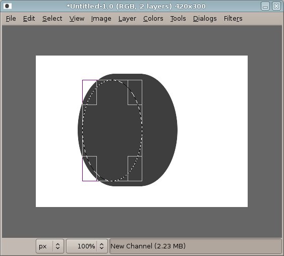
One of the most common techniques I use, masked brushing involves creating a mask that defines an edge, then brushing inside and outside the mask to create shading. I'll demonstrate this step by step. Remember that you can save your created mask selections in many graphics applications! I name and save as many of my masks as necessary in case I need them down the road.
First, create a mask that follows the edge of the area that needs defining. Here I have created an oval mask on a new layer above a round shape.
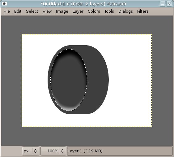
Second, using a brush tool appropriate for the subject, I will paint along the inside of the mask with shading and highlighting to create the desired lighting.
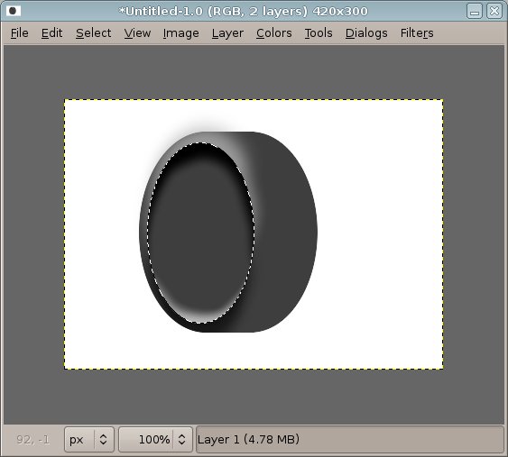
Now invert the mask, so that the opposite area of the subject is selected, and enable 'Preserve Transparency' for the layer. Then continue applying shadows and highlighting relative to the lighting in the scene. For this example, the highlighting is inverted on the outside of the selection. This creates a convincing feeling of depth in the center of the shape.
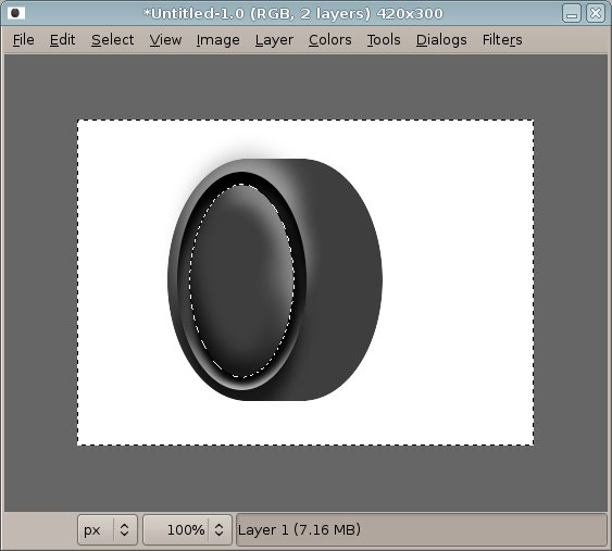
In this example, I've repeated the above steps on the same layer, simply working with a smaller mask. Here notice that the center appears raised rather than lowered. This is due to placing my highlights on the top of the inside of the shape, rather than the bottom.
Finally, with yet another smaller mask, I have created a new feature within the shape, and creating the appearance of a recessed area. Broad free brushed strokes have been used on the right hand area of the shape to create a feeling of roundness.
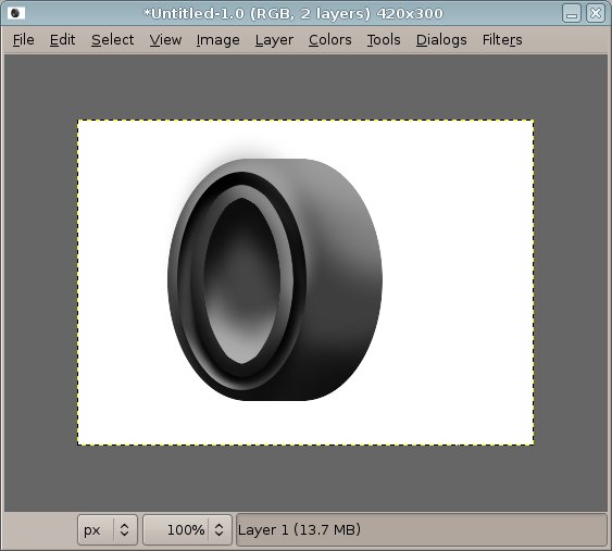
In review: Create a selection and shade first with shadows along the edge. Then invert the selection and shade with highlighting along the same edge. Remember to make use of the ?Preserve Layer Transparency? option when you want to avoid accidental over spray of layer transparency.
Example work
In these example images, I have used these technique repeatedly to form various shapes. Where appropriate I have also used some free brushing to further refine the shapes. Free brushing and masked brushing are flexible and easy to use. Learn to manage your layers effectively, when to merge, when to export a group of layers as a flattened image for easier manipulation.
Work in progress on the motorbike sketch:
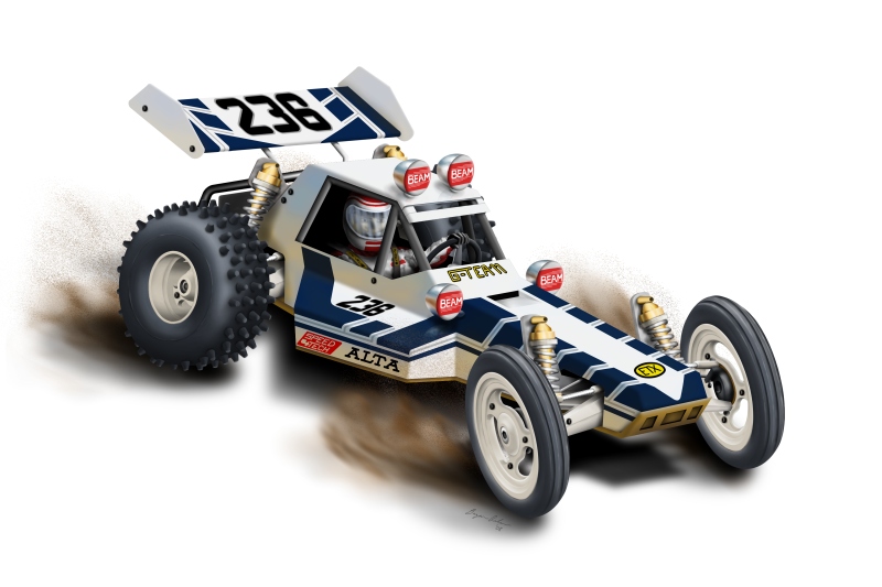
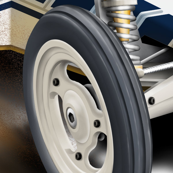
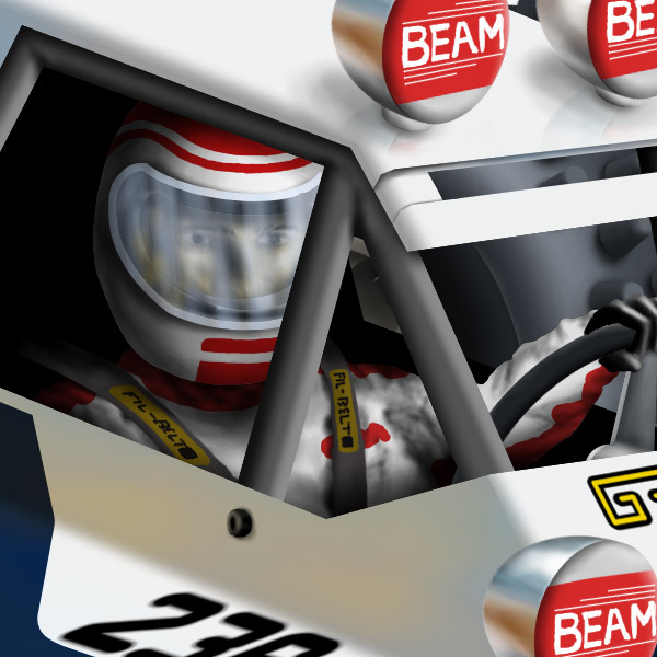
Completed offroad buggy painting, with detail images:
Last edited by Serval; 18th November 2015 at 14:33.
 Posting Permissions
- You may not post new threads
- You may not post replies
- You may not post attachments
- You may not edit your posts
-
Forum Rules
 Forum Guy


 Reply With Quote