

 Reply With Quote
Good start mate!

 Junior Member

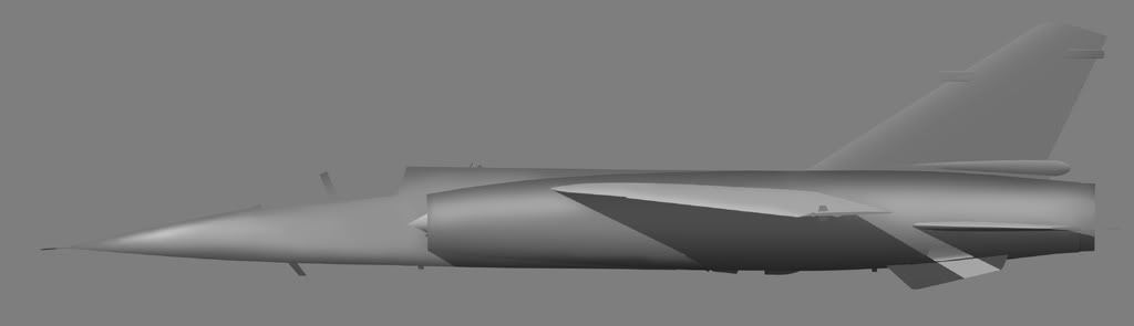
First profile for quite a while, and using Aircraftprofile's shading methods for the first time, too. The way I did profiles before usually limited me to doing one scheme without a major rework, but this time I've done it with several paint schemes in mind.
Would just like some thoughts on how it's coming along so far. Any comments, good or bad are appreciated.
Cheers!
Senior Member
Good start mate!
Senior Member
Nice start. A few comments:
* The wing should blend in the fuselage a bit more. Erase some of the light near the root. This way, it will look more natural and the wingtip will seem to stand out.
* You've achieved a very nice highlighting effect on the nose cone. You should extend that further, at least up to or past the cockpit, which looks flat.
Do you have any decent line drawings of the F.1? I've been looking for some for a long time with no success...
Junior Member
Thanks for the tips - shall get round to working on those areas now.
As for the line drawings, I used these these. Nice and comprehensive, with plenty of different variants of the F1, including a twin stick.
Senior Member
Nice work my young apprentice ;-) ! I feel quite flattered that somebody is acctually using my technique...glad that it have inspired you, and it´s good to see that you have come up with such a nice example.
I do however have some things for your consideration:
1. The shade on tope of the aircraft seem alittle too strong, try to tone it down abit (it´s almost as strong as the shade at the bottom of the aircraft)
2. The shadow cast by the wing and the tail should fade the further down the fuselage it gets. I´m not sure how to explain it, but if you light source is coming from a 12 o´clock high position (like I use), the shade from the a wing will ever be visible at the bottom of teh fuselage, since that part is shaded by the fuselage itself, rather than the wing.
3. Wing shades are hard...very very hard, but i have found that applying a light shade to rear par of the wing, and the part of the wing, taht´s nearest the fuselage, gives a nice effect. Teh wing you are depicting here, look too bright i my eyes.
4. The fuselage in front of the intake needs abit more shading i think. A light shade that streaches from the bottom to about the middle of the fuselage will make it look rounder, and be more consistent to the rest of the aircraft.
5. I´m by no means a Mirage expert, but i know many aircrafts from this era used a high gloss paint. If that´s the case for the aircraft you are depicting, you sould make a harder and more narrow highlight...that will give the impression of a higher gloss paint.
6. The shade from the wing on the smaller fin at the bottom of the rear fuselage, should be in a different angle than the shade on the fuselage.
I hope you can sue these comments...I think you are well underway, and this will be a great rendition once you are finished ! Keep up teh good work, and never hesitate to ask for advice !
Junior Member
Thanks again, and I've made a few changes in light of a few suggestions. However, I may have to take issue with a few points:
4. From what I can see, from photos on the web and from ones I've taken, the forward fuselage is quite flat, certainly compared to the nose cone.Originally Posted by Aircraftprofiles

5. Firstly, I'm concentrating on Spanish paints, which, depending on how freshly painted they are, they seem to vary from a fairly glossy to a matt finish. Seeing as I like weathered and dirty aircraft, I'll probably skip the glossy option!
6. I would have thought the same, but going by this photo, they seem to be pretty much at the same angle. I suppose the flaps could be down, thus changing the angle of the shadow? Can't really tell from that particular photo. I could have made a couple of errors though, so feel free to correct me.
And a slighly updated version:
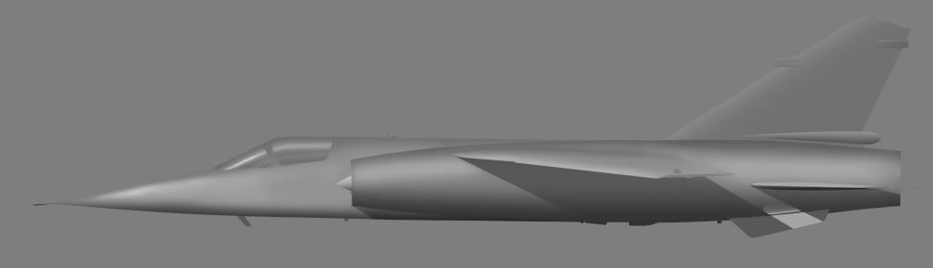
Last edited by Tweek; 29th September 2009 at 20:27.
Senior Member
Getting there ! Give me some time to look at it and i might have some additioal points to make...but i really like the shadings you have at the moment...keep up the good work !
Junior Member
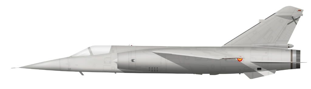
This'll do for today. Still some way to go, and still open to criticism:
Senior Member
Looking good !
I still think you should do two things:
1. Lighten up the shade on top of the aircraft
2. add a gradient shade under the wing and tail
other than that, it looks great !
Junior Member
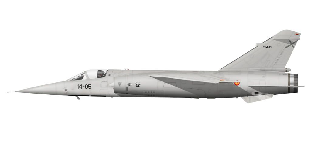
Took those points into consideration, and I've got it to a stage I'm happy with, so unless there's any glaring errors that need to be fixed, I consider it finished!
 Posting Permissions

