-
8th October 2009, 05:47
#11
Re: A WIP- my second attempt
Yer well on yer way Jay..or is that Ray....or maybe RayJay? Ok, bad comedy routine that no one remembers from Saturday Night Live. Hang in there bud....you're already cool. Listen to the advice of a few of the pros here and you'll slash and burn once you really get into it. Yer smokin!!!
-
26th October 2009, 01:50
#12
-
9th December 2009, 05:11
#13
Re: A WIP- my second attempt
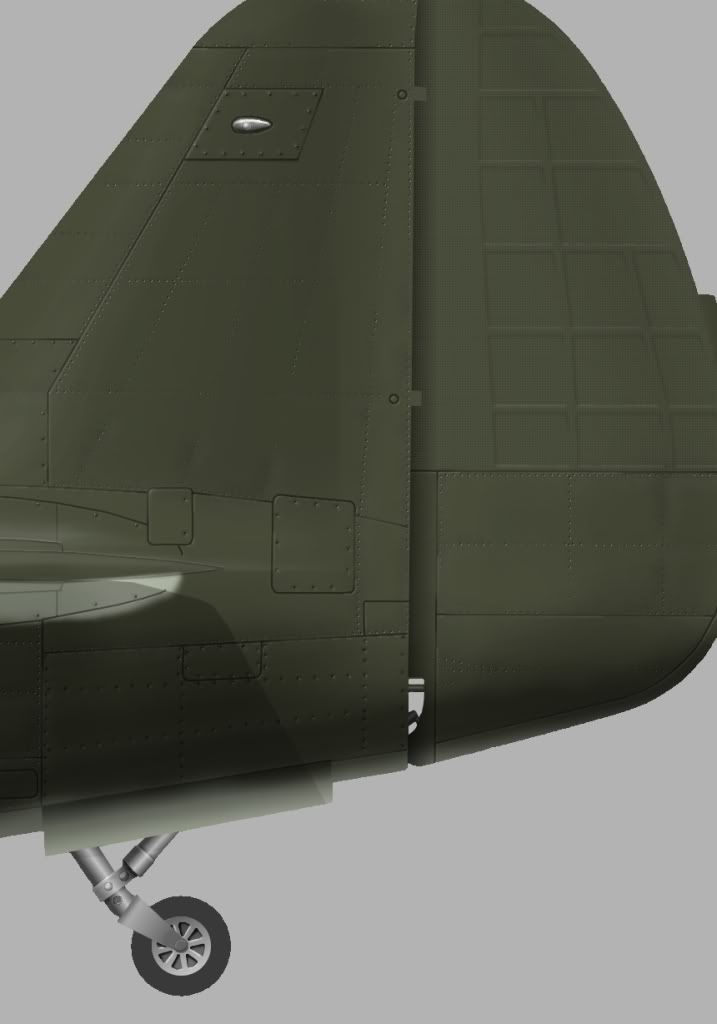
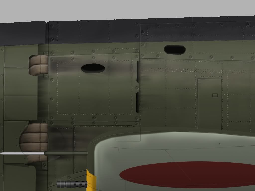
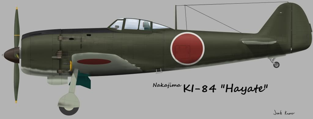
Hi all, I haven't worked on this in a long time, but I thought I'd post what I have at the moment:
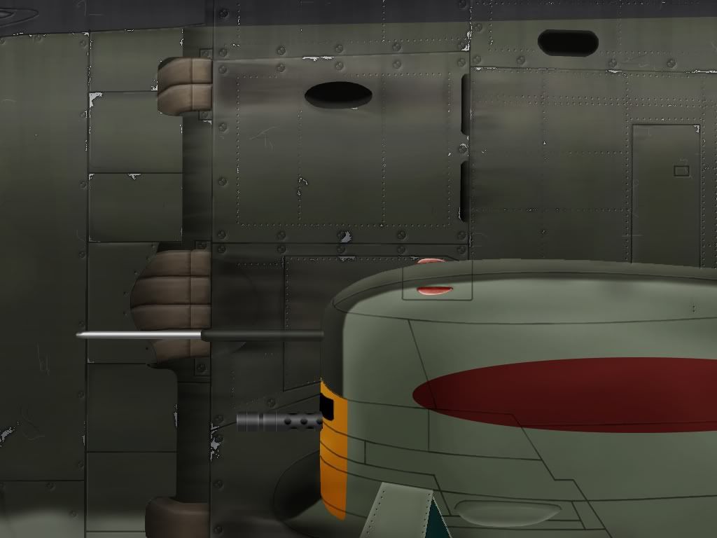
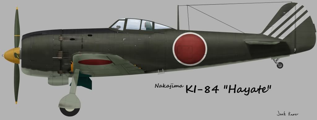
the 73rd Sentai markings are just temporary, I just threw them in for fun... still have a ways to go, but it's slowly getting there.
-
10th December 2009, 18:58
#14
Re: A WIP- my second attempt
Looks brilliant IMO. 
I'd only suggest you rework the canvas effect on the rudder, which doesn't reflect what it actually was I think. The green also seems a bit dark to me but I'm using an eeePC at work and it might just be bad screen calibration.
-
10th December 2009, 23:48
#15
-
11th December 2009, 08:44
#16
Re: A WIP- my second attempt
Yer second profile and yer already nearly a pro. Stick with us kid! These guys are the greatest and if you listen to them your work will improve by leaps and bounds. It's actually already pretty good.
 Posting Permissions
- You may not post new threads
- You may not post replies
- You may not post attachments
- You may not edit your posts
-
Forum Rules


 Reply With Quote