and ditto the comment abou the font used
 please do not send this for publication until you correct these problems


 Reply With Quote
I have to agree. It's one thing to just do this sort of art that we do for our own pleasure but if you are planning on publishing, please try to get it right.
I've seen WAY too many "reputable" sources that just didn't bother getting things like a font correct, just using what was on hand. It's one thing to interpret the artistic parts of this kind of thing, shading, lighting, and what ever other realistic or stylistic touches you want. But it's another thing ignore the reference material if one wants to create a representation of a real plane.
Perhaps we're all jumping down your throat here and you are doing this for yourself? That's fine. If you don't feel a need to recreate a type face/font style accurately, that' your call. But please don't add to a long line of shoddy inaccurate published profiles.
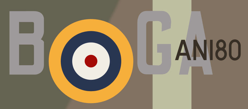
Just to show my heart (what there is of it) is in the right place, I spent a little under 15 minutes to show how easy this is to get right, or a lot closer.
Mine is FAR from perfect but I did them fairly quickly.
You've got a good almost perfect profile photo. The only thing not clear is the serial with the exception of the 0 and part of the 8. I'm sure looking over photos of similar marked planes one could deduce the exact style of the AN1.
How did I do it? I used a font that was close, one of the easily downloaded RAF fonts. I laid those out on the photo, converted them to vectored paths and made modifications so that the shapes and widths matched.
You're welcome to use these if you like. I'm not sure if the Photoshop paths will transfer with this jpg to this website but I do have a set of paths for these markings.