Looking forward to following your progress on this little "flea from hell". I've already redrawn 2.JG400's emblem as vector. Let me know and i'll fire it over to you. Check around as sometimes I think the text on the emblem was in a stencil style also.
Too funny! I vectored it too as a part of my Luftwaffe emblem series. I think I've got around 400 of them now. Here's my take on it. Yes, the lettering is stenciled. I had to hand draw because there's nothing even close to that in a font. It's one of the few Luftwaffe emblems I have good shots of. I draw the flame as a gradated tone, but I think you're right on solid red. I misread the lighting. The flea on yours is way too fuzzy though!
Last edited by Otterkins2; 20th February 2010 at 10:08.
Yes Otter I too tried to contort many different typefaces into the one on the emblem but also in the end gave up and had to redraw the lettering. Otter yours if redrawn from a photo is probably closer to the real thing, mine was out of the ketley and rolfe emblem (Hikoki) book and although very comprehensive many are not spot on exact renditions. Cool emblem though Fire me over the photo please dude.
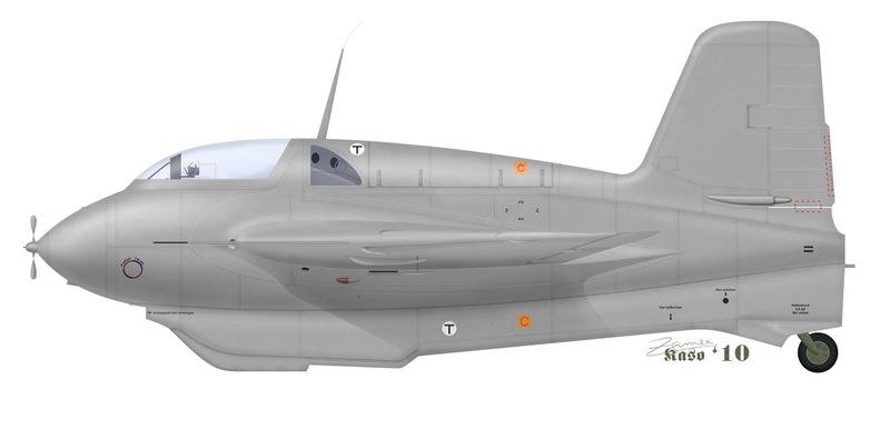
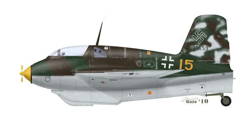
Very good start! You might want to make sure all of your shadows are coherent. The rudder trim tab actuator has a strong and dark shadow while the rest of the aircraft has lighter ones. Overall, I'd recommend reinforcing the shading to maje the shape stand out more.
You've done a good job with the wing, which is difficult to cope with on the 163 (I haven't drawn it yet but I'm expecting to, and I've already had a chance to study it from a profiling point of view).


 Reply With Quote
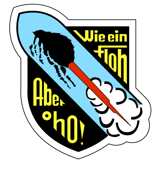


 Yes Otter I too tried to contort many different typefaces into the one on the emblem but also in the end gave up and had to redraw the lettering. Otter yours if redrawn from a photo is probably closer to the real thing, mine was out of the ketley and rolfe emblem (Hikoki) book and although very comprehensive many are not spot on exact renditions. Cool emblem though