Reply With Quote
jester photoshoped them

 Senior Member

Cough, cough shiny . . . right back atcha John Shiny
Senior Member
jester photoshoped them
JMSmith (back by popular demand)
Senior Member
LOL
Senior Member
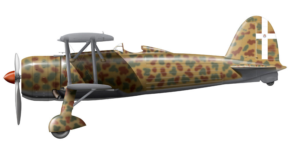
I think this is a very good efford ! However, i have one thing for your consideration: The highlight on the fuselage behind the wing, is not quite right in my eyes. If you light source comes from ahead the highlight should fade as you get closer to the tail of the aircraft (because the fuselage surface faces more and more away from the light source). However, on your rendition the highlight fades, and then gets brighter again...Other than that i think this is a very near profile...How about making the surface of the aircraft a little more bumpy...i´m sure those old props had a pretty uneven surface even when they was rolled out of the assembly line.
Senior Member
Have to say, most of Regia Aeronautica had an almost glossy finish, especial those on 1939-41 years. There are plenty of photos that show this effect, as Kakkuk picture shows as well
Ugo
Senior Member
thats it Ugo!
YOUR SACKED, fancy siding with Jester
JMSmith (back by popular demand)
Senior Member
That's an italian airplane afterall, John
Ugo
Grand Wazoo
Get over the gloss you matt paint fans! I like matt paint, especially for models. But Kakukk can't be faulted (jokes or no jokes for showing the paint finish for what it is.
The shine is in!
Now on to business. Kakukk, I'm sorry I haven't gotten around to this sooner. I see a few things you may want to consider looking at and maybe fixing.
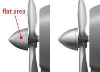
Your spinner seems like it has a flat-ish spot on it. I think you need a smoother more continuous blend from dark to light.
Mine is a but lopsided and isn't quite right but you get the idea. Think round
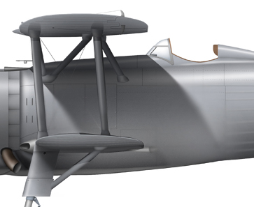
I really think cast wing shadows should be adjusted. This is more personal taste rather than proven. Sure, you can find photos that show the kind of shadows you have but you can also find shadows like I suggest. I feel the shadow, like a highlight, should be affected by the shape and it's proximity to the object casting the shadow. The further away from the object, the less strong the shadow should be and the softer it's edges should be. This will greatly improve the three dimensional quality.
This is crude, I know...but...
Plus, I think for the shadows you have, your entire lower fuselage would be as dark.
I think your wings look fine though. I know you have doubts about them, maybe you could elaborate on that?
You could beef up the darker parts on the wing underside and it would make them stand out and look a little more dramatic but I would go too far with that.
You've got 2 kinds of form to show with wings. One is the depth of the wing as it comes away from the plane and gets closer to the viewer. You can either show the receding of the wing from close to far away by having it lighter close up and darker further away, or the reverse. I prefer to show proximity with darkness and lighten it as it recedes. But showing the wing as you have it, lighter close up and darker further away is equally accurate depending on the lighting. The other part is the airfoil section. You can go light in the center and dark at the edges or the other way around. again, depending on the light, both can be correct.
There is a third element with bi-planes, especially, shiny gloss (gasp) surfaces, reflected light and shadow. In your shading you've shown the shadow of the dark fuselage, itself in shadow, reflected in the center section of the wing and you've got light from the lower wing top reflecting through the center of the top wing underside.
In short, I think they look right
About the camouflage, it seems a bit dark to me with the exception of the tail and rudder surface. Here lies the problem with working in one color. Shading on a medium gray might look spot on but not look right in the finished colors. I think a balance between the gray test scheme and the final paint needs to worked out.
Anyway, perhaps you could try lightening your colors a bit?
You might need to adjust your shadows some though to take some of the dark out of the darker parts. This is complicated stuff so you'll need to adjust it until it looks just right to you. You might find lightening the color or shadows doesn't look right to you, it's your call of course.
All around, nice work!
FAST AND BULBOUS!
Senior Member
Blowhard!
I'm very thankful for this help to you.I agree with you and now i see the good way.
In my opinion this post is a good introduction for everyone.
Salute!
Senior Member
First Changes:

 Posting Permissions