Results 1 to 6 of 6
  1. #1
    Join Date
    Oct 2005
    Location
    Central Florida
    Posts
    117
    Downloads
    0
    Uploads
    0

    World War I colour charts?

    Has anyone knowledge of a site with some colour charts of WWI? I have tried to match some of the WW2 colours with no luck, and I don't seem to be able to adjust them "just so". I am particularly interested in RFC/RAF colours. Thanks in advance.
  2. #2

    Re: World War I colour charts?

    Well isn't this THE question? I don't know that many, if even 2 WW1 color experts can agree on exactly what the exact colours were! Mostly it's the fact that surviving samples always have a shadow of doubt on them because of aging and weathering. You're mostly interested in RFC colours for now and it just so happens I've done a bit of studying on this subject...I can even tell you how to mix 50 gallons of PC10 dope
    Just a note, in case you're not familiar with the nomenclature;
    PC-10 is the standard color used on RFC planes, kind of an olive green to olive brown shade. There is also PC-12, a red brown, used mostly in the middle east, although it's thought that many more planes on the western front were painted this colour due to new research.
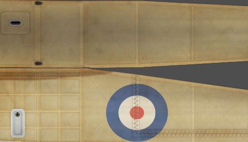
    Here are 2 samples jpegs I made-

    This is a scan of an actual piece of WWI PC-10 doped fabric I have, a RGB match that I did by eye, an average RGB I got from using Photoshops eyedropper, and 3 VASTLY different RGBs of FS colors quoted from online sources. I think the last of the 3 online FS colors must be PC-12 but it was marked as PC-10


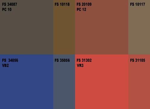
    These are FS conversions, the larger chips use FS numbers quoted from Windsock sources, the smaller of the chips are FS numbers from online.
    Left to right, top to bottom they read "PC-10 (Windsock)/PC-10 (online), PC-12 (Windsock)/PC-12 (online), VB2 (Windsock)/VB2 (online), VR3 (Windsock)/VR3 (online)" The blue and red are the ones that were used from late 1916/early 1917 through to the end of the war. Other versions were used beforehand that are probably different shades but I didn't research them.
    Basically, the rule is that PC-10 generally starts out more green-ish brown earlier in the war and ends up more brown toward the end of the war. I have a feeling anything goes here as long as you feel it looks right based on your experience. I tend to prefer the browner shades myself. Fox used a more green version for his Camels. He also used a darker blue and red for his cockades, maybe because of the stories of the national colors weathering darker after time.
    I personally prefer the brown-ish shades my self for aesthetic reasons


    As far as the natural fabric? Anyone's guess here too. I think as long as it's not too light, or too dark, you're pretty safe. It should be a bit yellow though, blue-ish natural fabric wouldn't seem right
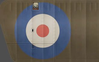
    Here's a sample of what I'm using now-


    Misterkit paints have these chips-
    http://www.misterkitusa.com/95b2ba67...23f874e-9.html
    The PC-10 and 12 look kind of gray and washed out to me.

    FAST AND BULBOUS!
  3. #3
    Join Date
    Oct 2005
    Location
    Arkansas, USA
    Posts
    309
    Downloads
    0
    Uploads
    0

    Re: World War I colour charts?

    Another interesting point with WWI doped fabric was that it wasn't completely opaque - if it was backlit you could see the internal frame structure of the aircraft right through it. I'll know that we've arrived if they ever come up with a sim that can duplicate that effect!
  4. #4
    Join Date
    Oct 2005
    Location
    Central Florida
    Posts
    117
    Downloads
    0
    Uploads
    0

    Re: World War I colour charts?

    Thanks Blowhard that is fantastic! I sort of realized that WWI colours would be very difficult to nail on the head. All I could find was the IPMS site, and it's samples weren't the greatest for picking colour out of. If I stared at them long enough I could see 3 separate colours within the chip. Thanks again m8. (BTW, the wife says I need to restain the front wood siding, you can mix me 50 gallons of wood stain if you like! )

    Vigilante, I have thought the same thing. I wonder if it is that hard to duplicate that effect in a game? It could be done from a skinning point of view, but would look odd when the view angle is changed.
  5. #5

    Re: World War I colour charts?

    I'll get right on mixing that stain for you...

    We've tried doing the translucent wings in Targetware with 3D settings. To do this, the wings are actually transparent and the 3D model has ribs and spars. The problem is, unless the model has all the correct details it doesn't look 100% realistic.
    I usually indicate this with paint, that has problems too but I'm not sure if either solution is perfect. But, as I'm a paint guy, I prefer paint
    Here's a few of my paint samples-


    Keep in mind, that PC10 dope is pretty damn opaque, I doubt any light would get through it. It's almost incorrect to call it dope, it's really pigment and dope mixed together, kind of a dope/paint hybrid.
    The natural clear dope or varnished fabric is pretty transparent with light behind it though. With natural fabric you'll always see a little ghosting of what is behind it I think.

    FAST AND BULBOUS!
  6. #6
    Join Date
    Oct 2005
    Location
    Arkansas, USA
    Posts
    309
    Downloads
    0
    Uploads
    0

    Re: World War I colour charts?

    Wow, that's gorgeous.

Similar Threads

  1. Problem with text and background colour
    By Chompy in forum Feedback and suggestions
    Replies: 6
    Last Post: 15th August 2005, 17:23
  2. US Navy colour photo's
    By Serval in forum General Discussion
    Replies: 0
    Last Post: 12th August 2005, 13:42

Posting Permissions

  • You may not post new threads
  • You may not post replies
  • You may not post attachments
  • You may not edit your posts
  •