Results 1 to 7 of 7
  1. #1

    Gauges & Vectored Paths

    This is an updated and expanded version of the earlier tutorial of the same subject. It is specifically for Photoshop but can by used in general for any application that uses vectored paths.
    If you are not familiar with using paths please see this tutorial-
    Vector Tutorial
    (wasn't there a pen tool tutorial here at Simmer's?)
    Also, before you begin here, make sure you see Adlabs gauge making tutorial here-
    http://www.simmerspaintshop.com/foru...read.php?t=471
    So, now you know a bit about using the pen tool to make vectored paths and have an idea of how to build gauges. Now comes the hard part, duplicating strange and often hand painted numbers and letters found on real aircraft gauges. These unique fonts are very important to the look and feeling of these vintage instruments. If you want an accurate look, you'll just have to do the extra work and give up on available fonts. It doesn't matter how many fonts you have, you never find a font EXACTLY like what you'll see in most WW1 and WW2 aircraft gauges.
    One solution to this problem is to use the pen tool and draw the fonts by tracing around an actual photo. But even easier is to find a font that is close and then convert it to paths. That path can then be infinitely modified until it is as close as you feel necessary.

    Step 1
    Starting with a good image, make sure it is centered and roughly squared up.
    Finding good images can be tough. This one isn't 100% square or centered but I'll deal with that later.
    Name:  1.jpg
Views: 6430
Size:  224.4 KB

    Step 2
    Find a font that's close. Type out what numbers or text you'll need. In this case 0, 1 and 5 are all I'll need. Get them roughly sized.
    Name:  2.jpg
Views: 6395
Size:  232.6 KB

    Step 3
    Create a work path as shown.
    Name:  3.jpg
Views: 6301
Size:  233.1 KB
    *Note a work path IS NOT permanent, if you've got a work path already on your file and you create another work path, the new path will replace your old path. This can be very bad for you if you've spent a lot of time modifying the path only to lose it :P REMEMBER to save the paths by naming them as you go. You do have history but if you've done this without realizing it your history might have gone past the point of return.


    Step 4
    Now that you have your paths to work with you can eliminate your font layer and start sizing and modifying the character.
    Name:  4.jpg
Views: 2527
Size:  161.5 KB
    Name:  5.jpg
Views: 2517
Size:  162.8 KB
    Name:  6.jpg
Views: 2503
Size:  173.9 KB
    Name:  7.jpg
Views: 2496
Size:  164.6 KB
    Name:  8.jpg
Views: 2485
Size:  164.3 KB
    Name:  9.jpg
Views: 2468
Size:  160.6 KB
    Name:  10.jpg
Views: 2438
Size:  161.1 KB

    Using whatever methods needed, get the path as close as you want. You can get really crazy here. I feel close is good enough, so long as it retains the general feeling of the real gauge.
    Name:  11.jpg
Views: 2432
Size:  181.4 KB
    Keep in mind that you may want you letters or numbers a bit thicker than they are in your photograph, you don't want them to disappear. You'll develop a feeling for this as you go.

    You might want to check your progress as you go by filling the paths on a new layer. Here is what I've got so far-
    Name:  12.jpg
Views: 2433
Size:  108.3 KB

    Do the same for the rest of the numbers. Copy and paste as you go. Remember to select all the points before you copy or to use the black path selection pointer.
    Name:  13.jpg
Views: 2421
Size:  170.9 KB
    Name:  14.jpg
Views: 2409
Size:  166.6 KB

    All numbers in place-
    Name:  15.jpg
Views: 2404
Size:  190.1 KB

    And a check of all the numbers-
    Name:  16.jpg
Views: 2400
Size:  123.5 KB

    Step 5
    Now, the lettering, same as above-
    Name:  17.jpg
Views: 1885
Size:  199.4 KB
    Name:  18.jpg
Views: 1882
Size:  181.4 KB
    Name:  19.jpg
Views: 1874
Size:  188.4 KB
    Name:  20.jpg
Views: 1877
Size:  192.1 KB
    Name:  21.jpg
Views: 1871
Size:  181.8 KB

    In this case some of the lettering can be reused, but a few new letters are needed.
    Name:  22.jpg
Views: 1863
Size:  142.6 KB
    Name:  23.jpg
Views: 1841
Size:  148.3 KB

    The paths so far-
    Name:  24.jpg
Views: 1840
Size:  129.7 KB

    And a check-
    Name:  25.jpg
Views: 1842
Size:  127.5 KB

    Step 6
    Using the shape tool set to paths in the tool presets, I've created the ticks using the same methods Adlabs uses. However, these are NOT symmetrical ticks, they contract a bit as the numbers get higher. I use my Mk.1 eyeball but I'm sure some tricky math could be employed.
    Name:  26.jpg
Views: 1711
Size:  202.9 KB

    And a check of the progress-
    Name:  27.jpg
Views: 1703
Size:  138.6 KB

    Now the curved arrow, drawn free hand, but using the same principles.
    Name:  28.jpg
Views: 1690
Size:  149.4 KB

    And the "m/s" -
    Name:  29.jpg
Views: 1698
Size:  146.5 KB
    Name:  30.jpg
Views: 1690
Size:  183.2 KB

    All together-
    Name:  31.jpg
Views: 1683
Size:  139.6 KB

    A few adjustments to placement and another check to make sure everything is squared up and evened out-
    Name:  32.jpg
Views: 1675
Size:  139.6 KB

    Now with the bezel art and blank dial face, paths only-
    Name:  33.jpg
Views: 1676
Size:  200.0 KB

    Step 7
    Use the path to fill all your markings in appropriate colors on a new layer. I like to add a bit of noise to them as well.
    Name:  34.jpg
Views: 2399
Size:  232.3 KB

    On this one yellowed markings are most likely some sort of glow in the dark paint. The paint looks really thick and built up so I put some 3D effects on them.
    Name:  35.jpg
Views: 2406
Size:  229.8 KB

    The finished version with glass effects.
    Name:  36.jpg
Views: 2393
Size:  223.1 KB

    You can use these same techniques to create any unusual letters and numbers. You can now have all you fonts ant letters on one easy to manage path and arrange them on layers however they are needed. Also, the paths can be enlarged to any size without loss of detail.
    It looks like a lot of work, and it is. But if you want to do it right, you need to do the extra work.
    This method, using paths as Adlabs shows in his gauge tutorial has been discussed on the Targetware forum. Several people swear that Illustrator is better for doing this. I feel there are no benefits to using Illustrator in this case other than if you are more comfortable using Illustrator over Photoshop. The end result will need to be in a paint application at least by the time you are ready to render the finished version. I would rather use just the one application from start to finish.
    Last edited by Serval; 18th November 2015 at 14:35.

    FAST AND BULBOUS!
  2. #2
    Join Date
    Jul 2005
    Location
    Tracy Island
    Posts
    2,009
    Downloads
    0
    Uploads
    0

    Re: Gauges & Vectored Paths

    Blowhard... great article. Thank you.

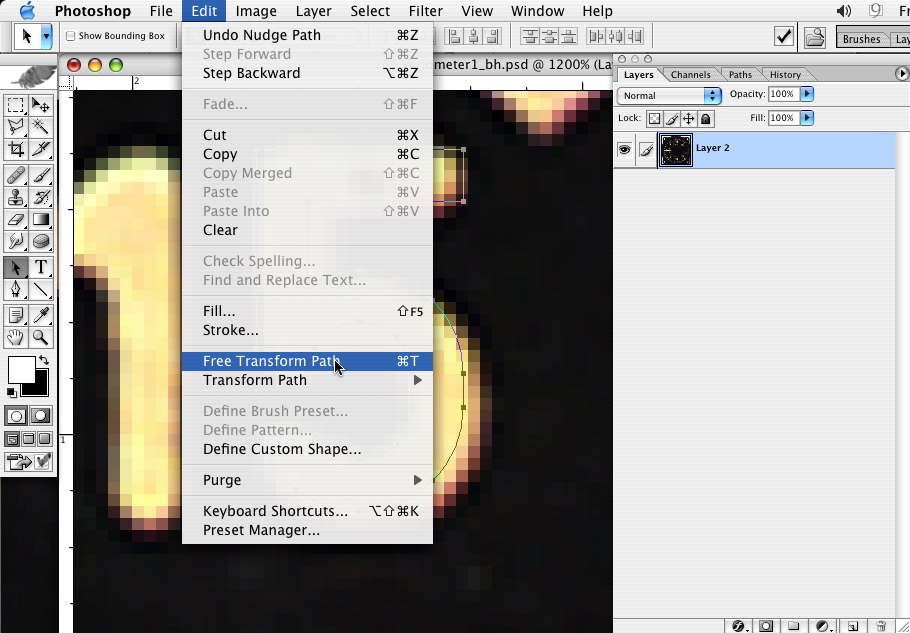
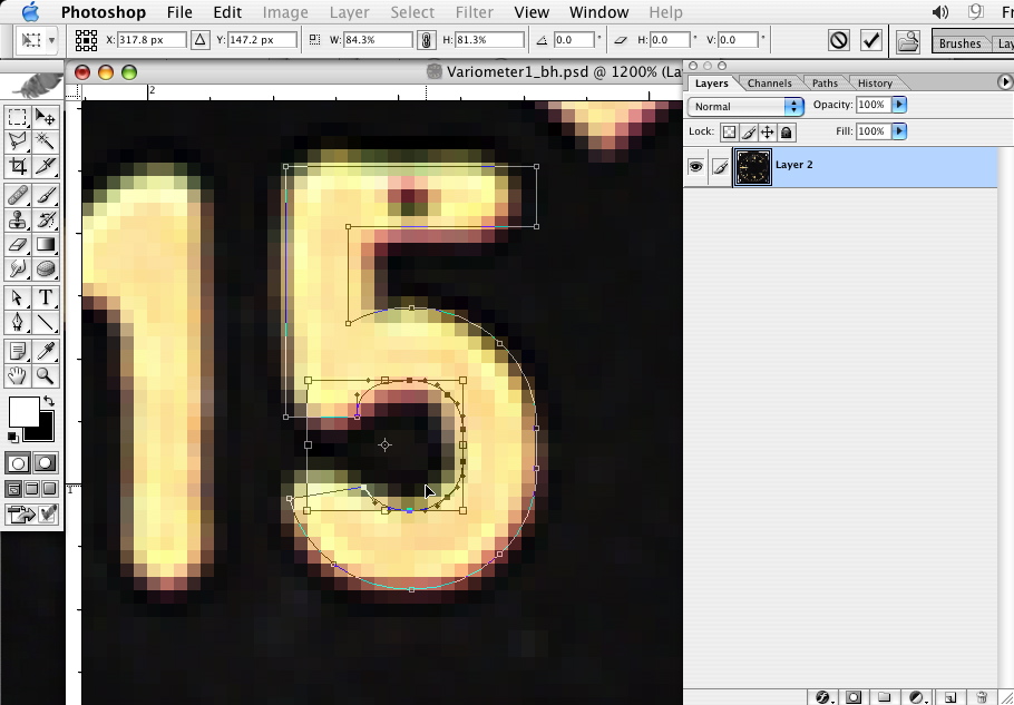
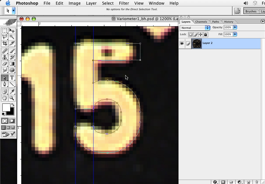
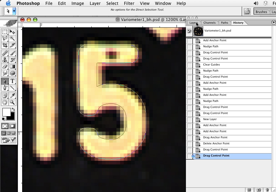
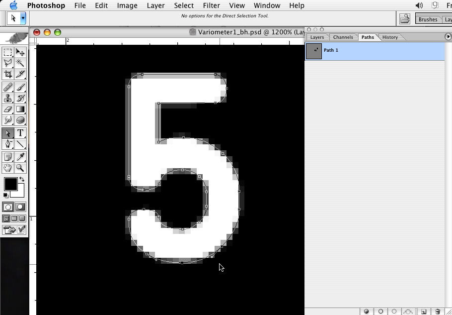
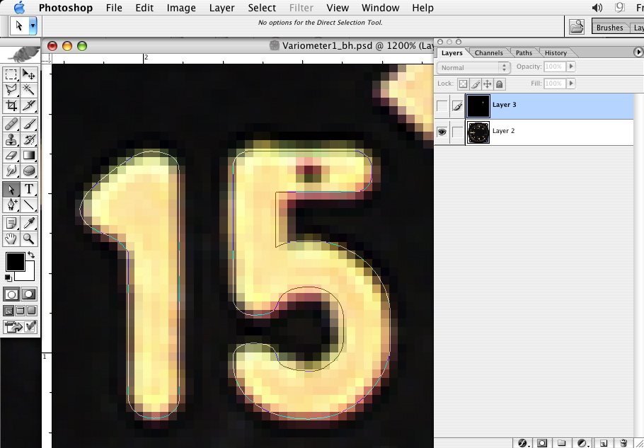
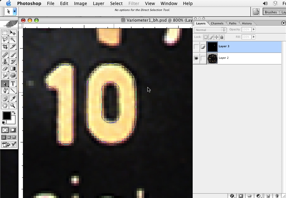
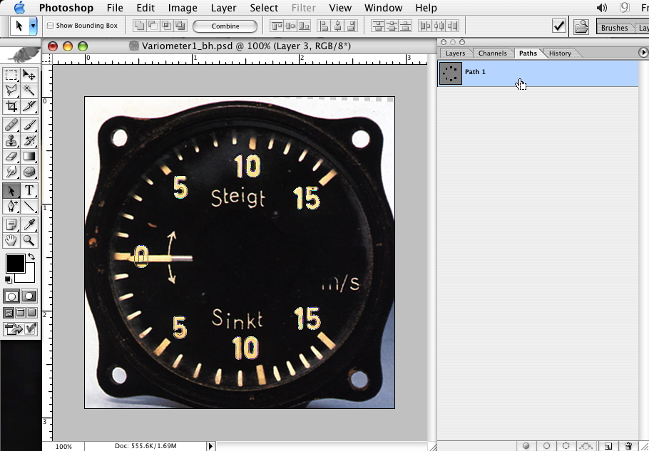
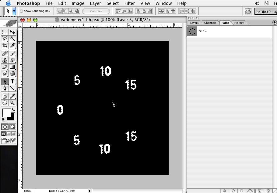
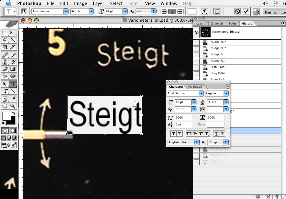
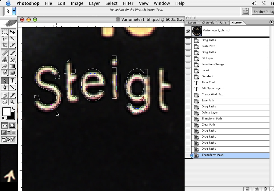
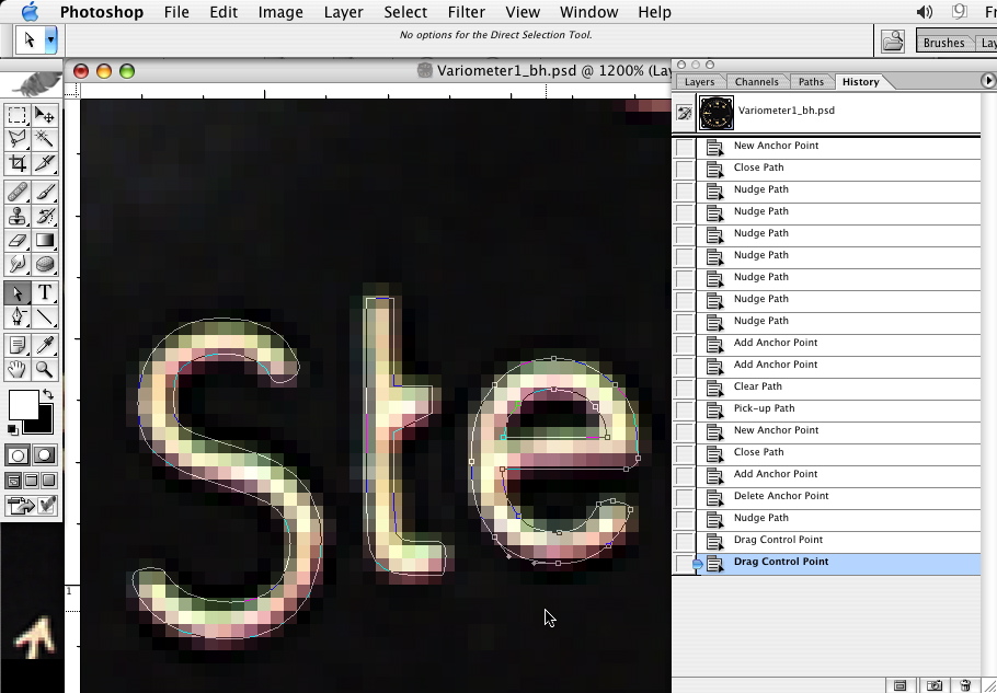
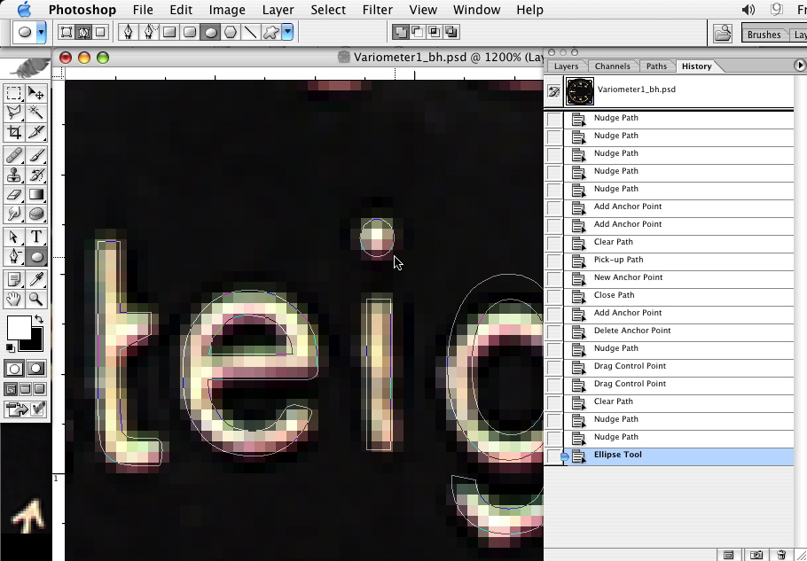
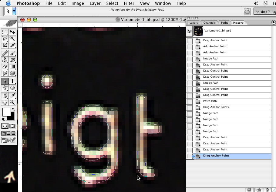
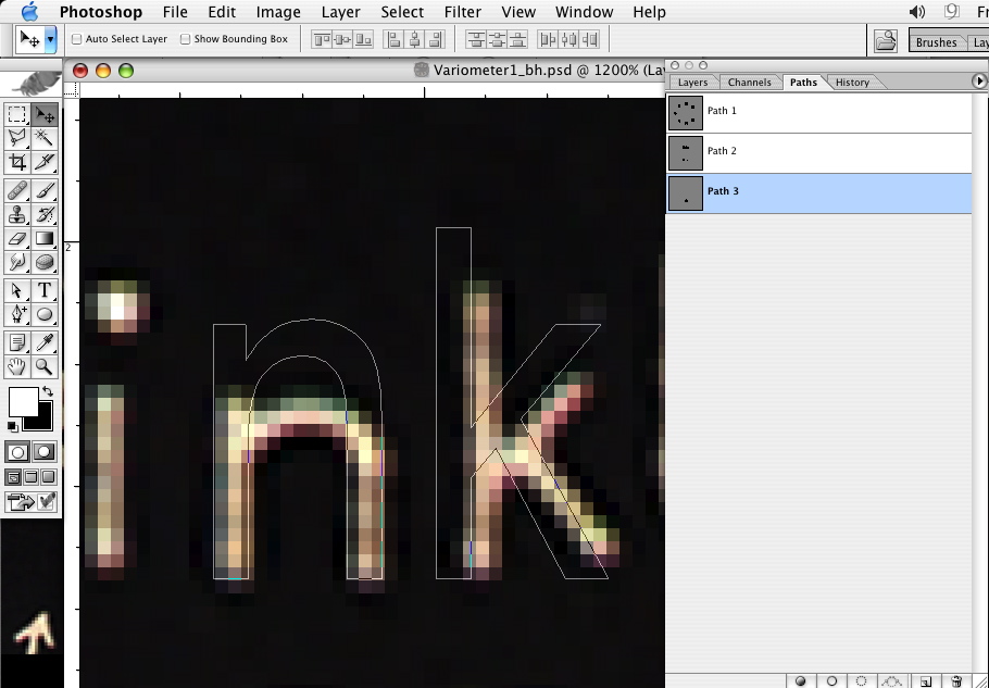
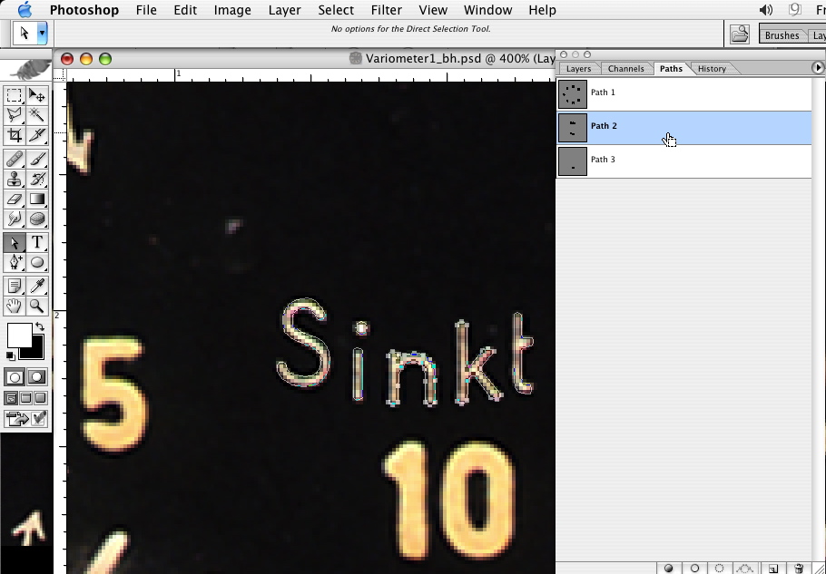
    Your screenshots show so many interesting features over my PS Elements 2. Someday I'll have to save towards a copy of that, or maybe I'll consider the more full featured PaintShop Pro... much easier to afford. Plus I can give better support to the many PSP questions we receive.

  3. #3

    Re: Gauges & Vectored Paths

    Thanks for the tutorial. Would you mind sharing the layer .psd so that we can play around with it ? How did you actually created the bezel ?
    Last edited by Tex-Twil; 8th June 2011 at 18:15.
  4. #4

    Re: Gauges & Vectored Paths

    Nope, not for a for profit deal, sorry. I created the bezel in Photoshop the same way as all of us create our profiles. I'll be glad to help but I won't do the work for you

    FAST AND BULBOUS!
  5. #5

    Re: Gauges & Vectored Paths

    Quote Originally Posted by BLOWHARD View Post
    Nope, not for a for profit deal, sorry. I created the bezel in Photoshop the same way as all of us create our profiles. I'll be glad to help but I won't do the work for you
    sure no problem. Another questions: when you apply the "noise" effect you actually lose the "vectors" and the file becomes rasterized, doesn't it ?
  6. #6

    Re: Gauges & Vectored Paths

    Well, yes and no. The vectors are used to select areas for fills, the vectored path still exists but once you fill that selection on a layer that layer with the shape is rasterized already.
    I think if you wanted non-rasterized files, you would probably be better off working in Illustrator and using effects on those shapes.
    Does that help? If you're worried about quality or resizing larger at a later point you could work much larger if you are using Photoshop.

    FAST AND BULBOUS!
  7. #7

    Re: Gauges & Vectored Paths

    Quote Originally Posted by BLOWHARD View Post
    Well, yes and no. The vectors are used to select areas for fills, the vectored path still exists but once you fill that selection on a layer that layer with the shape is rasterized already.
    I think if you wanted non-rasterized files, you would probably be better off working in Illustrator and using effects on those shapes.
    Does that help? If you're worried about quality or resizing larger at a later point you could work much larger if you are using Photoshop.
    ok. I actually started a new thread about this it would be maybe offtopic talking about it here

Posting Permissions

  • You may not post new threads
  • You may not post replies
  • You may not post attachments
  • You may not edit your posts
  •