
 Senior Member

This tutorial is will deal with weathering, there are many ways to do this.
This way is just one of them and there isn’t enough cyber paper on the internet to document them all here in this one issue.
Once you have done this a few times you will be able to experiment on your own and come up with some really nice effects, remember with art work as with anything else in life you are limited only by your Imagination.
FIG. # 1
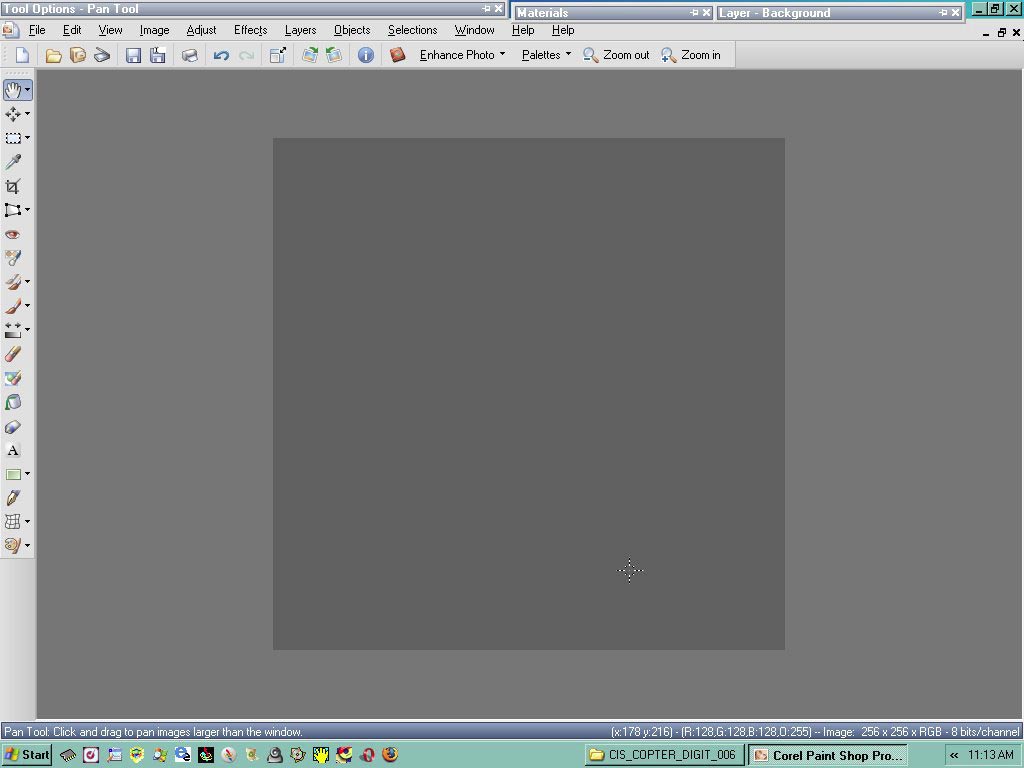
Start with a clean slate as shown, when you actually do this for real there will be about 10-20 more layers in your project, but for now we will be dealing with just weathering the lettering in here.
Weathering does not imply that it can only be done with letters.
This method or any other multitude of tricks can be used on anything you can imagine, Paint, placards, Logo’s, nose art, the list is endless.
FIG. # 2
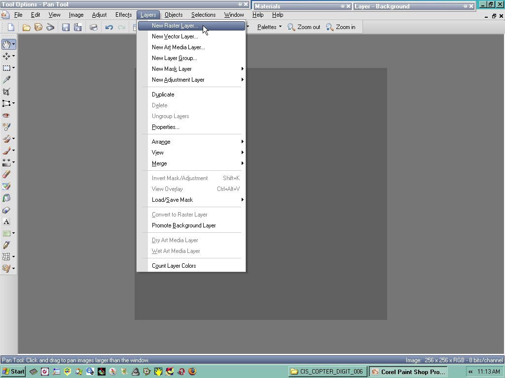
Im assuming if you’ve made it this far that there is no need to explain how to make a new layer, I use a lot of raster layers because Im a simple guy and I like things simple and easy.
The word lazy comes to mind as well.
So make your new layer and call it number, or letters what ever the moment calls for.
FIG. # 3
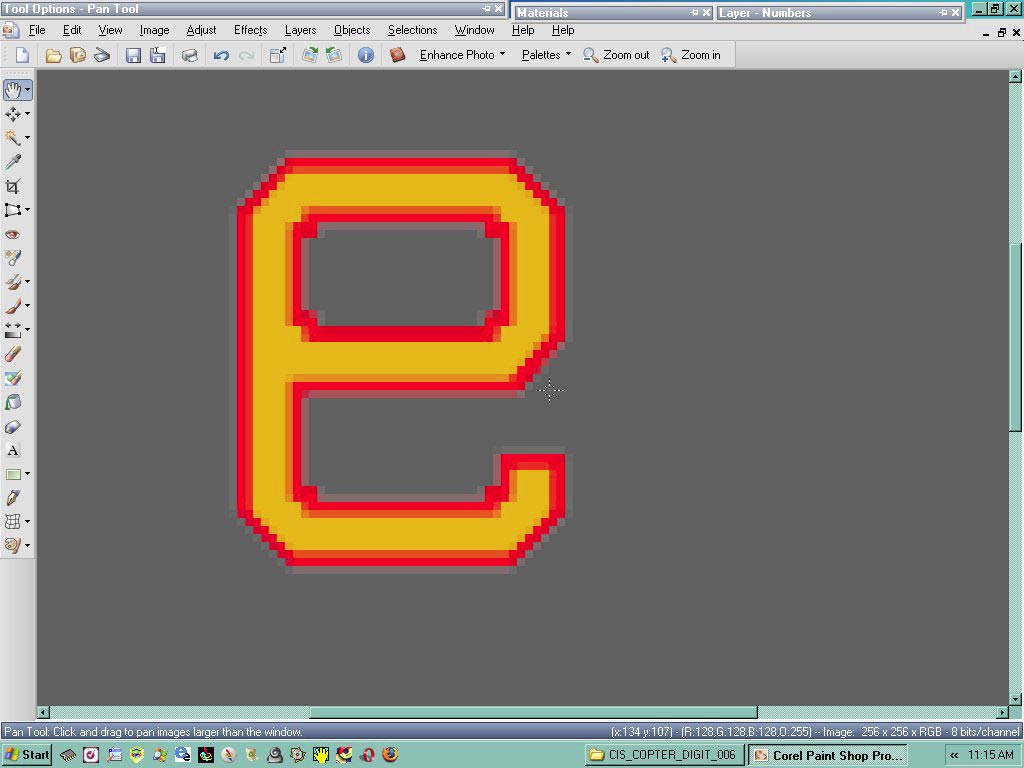
Now copy and paste your number as a new selection onto your raster layer you just made.
You can also copy and paste as a new layer without having to make a layer manually.
Im retired so I have an abundance of time on my hands that I have to burn up some how.
If you haven’t noticed the number is backwards, a Jedi Mind trick to make sure your paying attention.
FIG.4
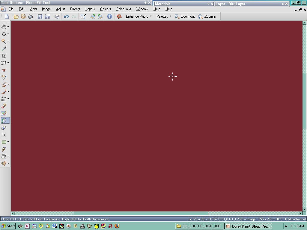
Here I made a new layer called dirt… you can name it what ever you want to
Once done I can adjust the opacity of this layer making it see thru to simulate a thick layer of dark colored dirt or mud.
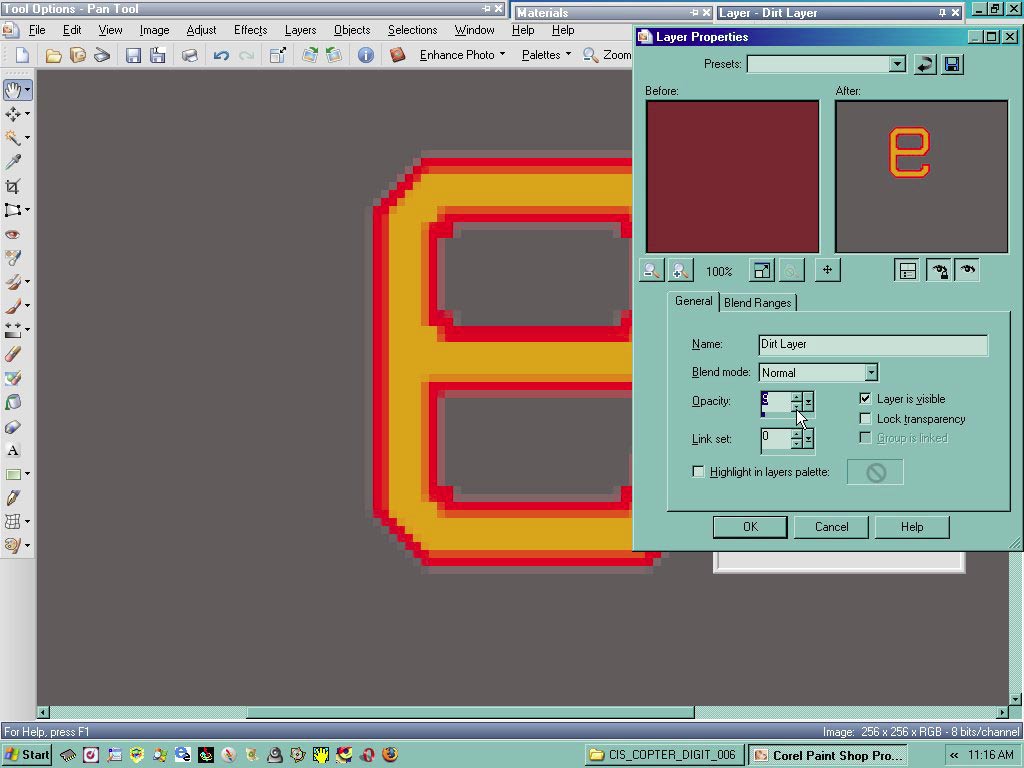
FIG. # 5
Here you can see the layer properties box, IM assuming that you know about the properties box?
Once here you adjust the Opacity of the dirt layer as shown, you can see the original layer on the left, and the adjusted layer on the right, once you have achieved the desired opacity of the layer in question, click ok and it will make the changes and adjustments to the actual layer itself.
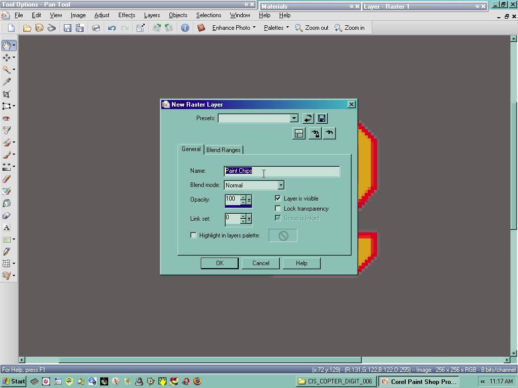
FIG. # 6
Here I have made a new layer called paint chips, once I have made this layer I choose a light gray paint whish simulates the metal beneath the actual paint of the number or letter in question which is now showing thru the paint.
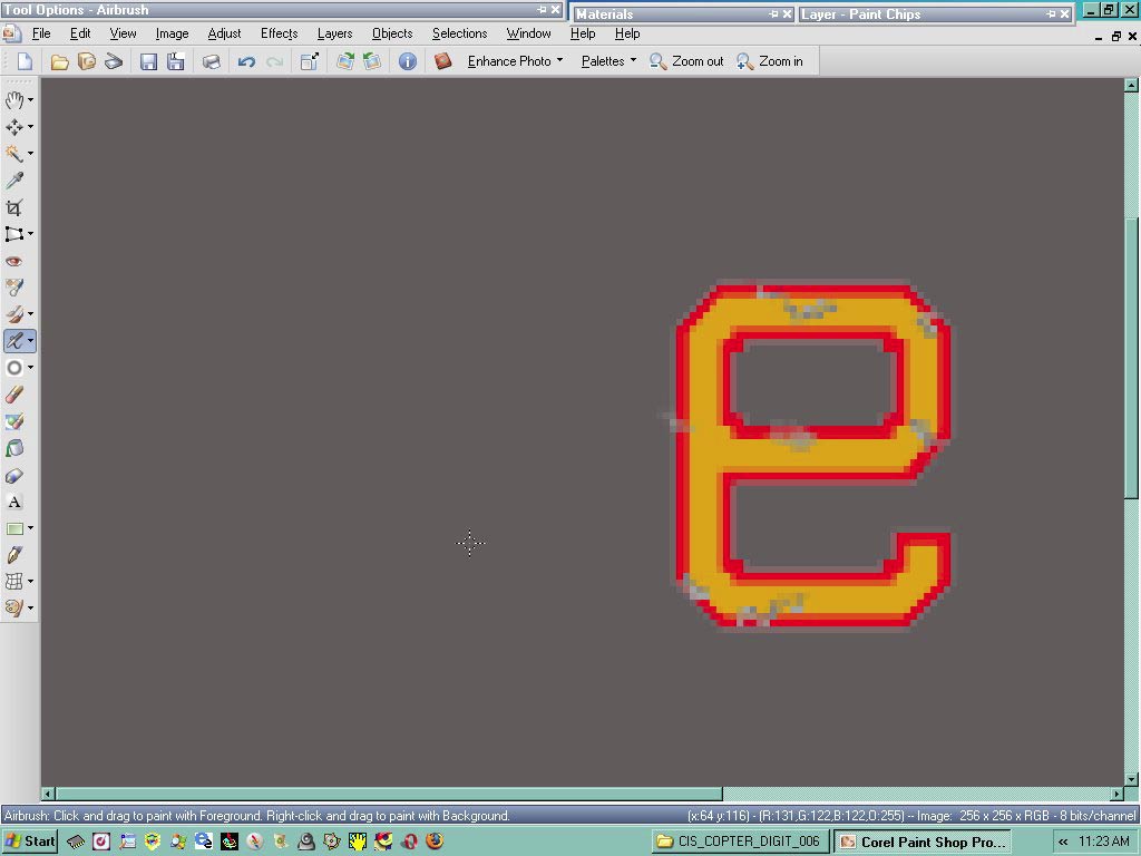
FIG. # 7
Using a 1 pixel brush slosh around some paint until you get the desired effect your looking for, once done you can go back with a softening tool to get rid f the jagged edges.
FIG. # 8
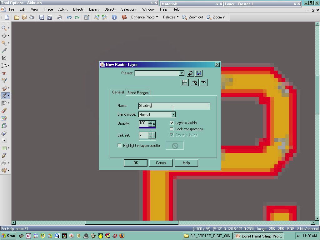
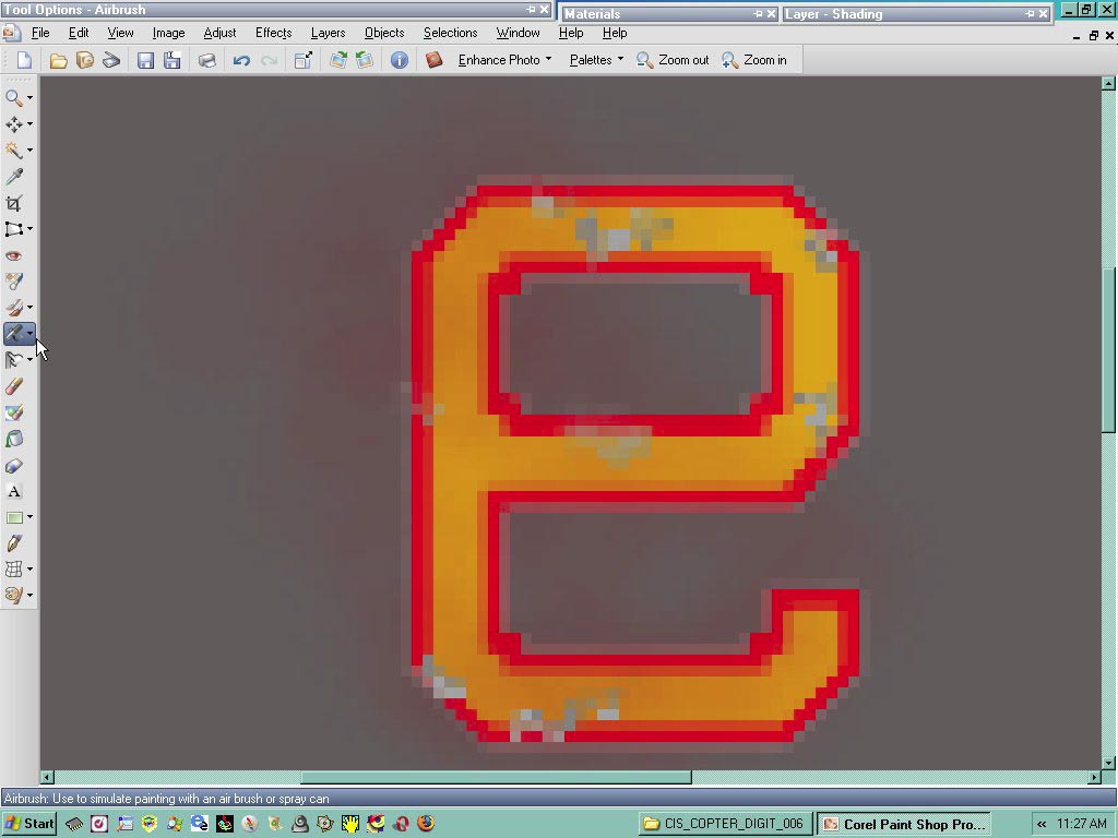
Here I made a new layer and called it shading, on this layer I took my spray paint and just shot some color across the number in question to get a different look.
FIG. # 9
Showing the color from the spray paint gun.
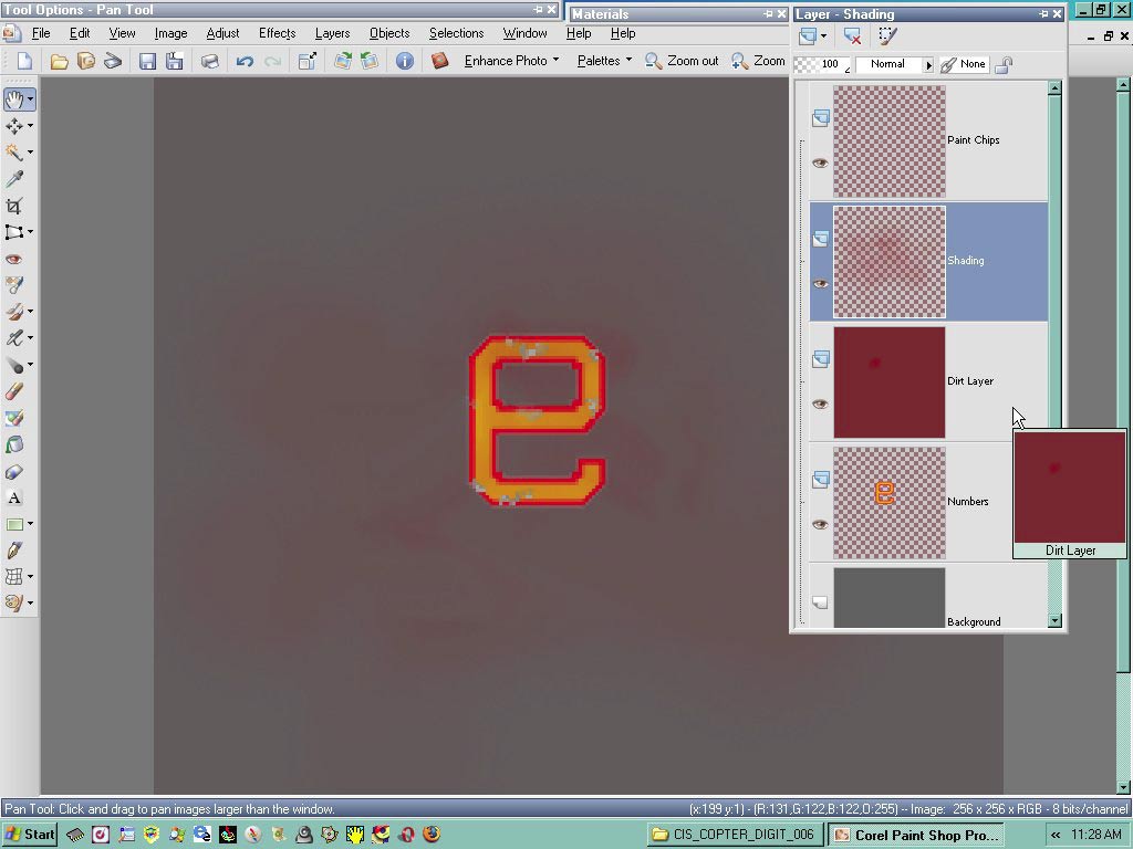
FIG. # 10
Here you can see the nearly complete project, you can do this any way you want, in any order you want, again your limited only by imagination.
Hope this was of help.
Charlie
Last edited by Serval; 9th December 2015 at 23:03.
 Posting Permissions


 Reply With Quote