
-
13th September 2007, 20:10
#1
-
13th September 2007, 21:16
#2
Re: I-16 WIP
Very hard to get AC to look right when they are mostly of wooden construction.
Have you thought about adding a wood grain texture as a very light overlay?
This would have to be done with care to also represent the foreshortening of curves too.
Don't forget there is always weathering and paint application too.
Must say, it’s a great start.
If in any doubt, always get hold of photographs of the real thing, or even better take your own of the real thing.
-
13th September 2007, 21:20
#3
Re: I-16 WIP
I think it's an excellent start. To be honest, my first impression did not even remotely feel like there was any texture missing on the fuselage areas. Perhaps it's because the shading is so very well done.
-
13th September 2007, 22:38
#4
Re: I-16 WIP
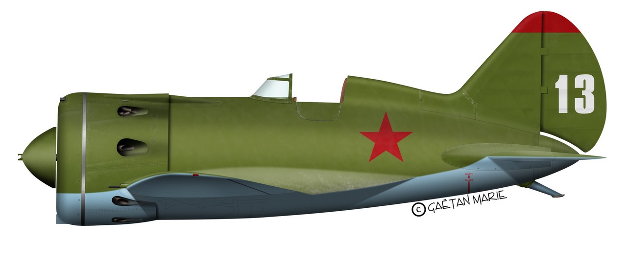
Thanks for your feedback. I hadn't thought about the wood texture and I'll try it. I'm not sure it should be visible however. I usually do my homework correctly and read a book or two about the AC I'm about to draw but I was lazy this time so I don't know exactly what type of wooden construction the I-16 uses.
I'll try it at any rate and post to show the results. As for the pictures, I do have several detailed walkarounds of the I-16. The problem I do have is that good pictures are usually those of restored ac and the restoration is not always very well done (question of money mostly I suppose). Older pics are better but not always easy to use.
I'm glad you like the shading. One of the reasons I did this bird was to put some "shading study" to practice, and I am rather happy with the results. The prop spinner was made using the older technique and it's not as good IMO.
I'll keep posting as I progress on this one.
-
14th September 2007, 07:33
#5
Re: I-16 WIP
Very nice! 

About the wood grain, it might make this thing really come alive, but on the other hand, if it's wooded, it would have been sealed and probably little or no grain would be visible. I do believe, like most wooden planes, there would be many variations in the surface from small warps and ripples to large dimples.
Also not too easy to get right. At any rate, based on your usually clean approach, I would keep any additional wood effects subtle and at a minimum.
About texture, yes, this would really look great with some variations in color and texture. But, again, your planes are clean and straight so this would be a different direction.
I think it's more a matter of your own personal taste. 
 FAST AND BULBOUS!
-
17th September 2007, 16:44
#6
Re: I-16 WIP
Very nice work mate I like so much the shading on this aircraft 
-
19th September 2007, 19:32
#7
Re: I-16 WIP
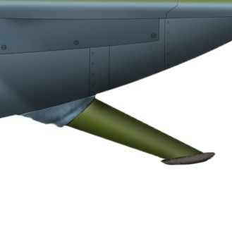
I've done a bit more work on the Ishak and given it a lightly weathered touch. I've applied very light wood texturing but, as Blowhard points out, it shoud be either discreet or non-existent.
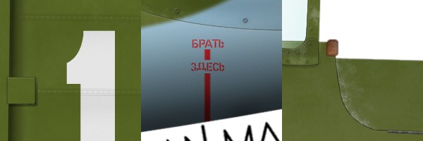
BTW, does anybody know what the Russian text under the tailplane means? I suppose it's "Lift Here" or sthg like that.
Hope you enjoy it. More work needs to be done but it's getting there.
-
19th September 2007, 20:41
#8
Re: I-16 WIP
Hmm, well I like your result. It adds some visual strength to the surface, but is subtle.
And I have nothing to compare it to BTW, just going on the impression in creates by itself.
-
20th September 2007, 05:59
#9
-
20th September 2007, 12:41
#10
Re: I-16 WIP
Glad you like it. As this is still the "template" file I'm working on, I didn't want to put too much weathering on it. I have the impression that most airplanes weather the same way at first with the usual wear & tear in the usual locations. However, after a certain point, weathering becomes more specific and should be done individually.
I'll post the finished version when ready. And then I'll start pumping out all the I-16 type 10s I can ...
 Posting Permissions
- You may not post new threads
- You may not post replies
- You may not post attachments
- You may not edit your posts
-
Forum Rules


 ) but I don't like the overall "feel" of the plane. It looks very much like computer art (which it is but I don't want it to show), and I don't really know what to do to break up the "monotony". I've tried adding some noise but the results were so-so. What I'm looking for is a more organic touch to it.
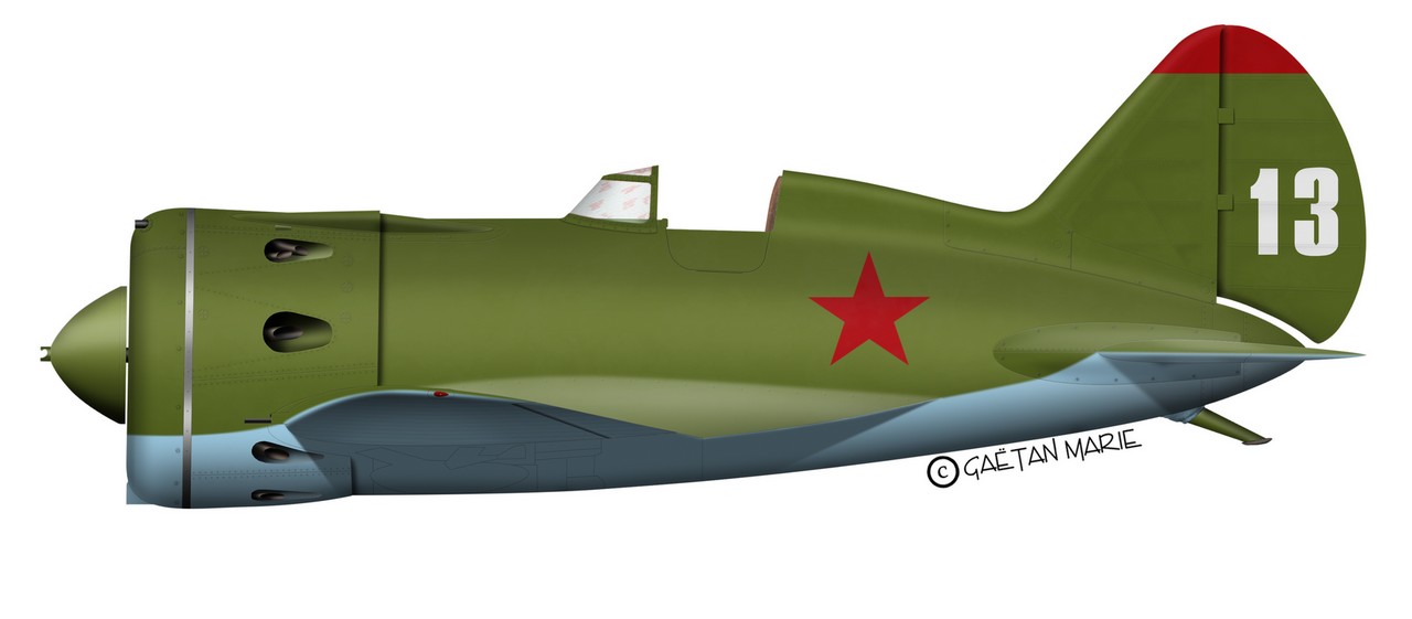

 Reply With Quote


