Reply With Quote
The first one is better but I would personally tone down the highlight and extend it down the fuselage more, the side looks a little flat instead of round. The same applies to the engine.

 Senior Member

Hi folks!
I'm interested in your opinion! I'm currently reworking some He 162 for a forthcoming publication! During that work I noticed that the general lightning of the planes could give the impression that they were painted with glossy colours! So I reduced the main lights on the fuselage, wing, engine and main wheel. What do you think looks better?
Cheers, Simon
PS: this profile will not be published in the publication
Senior Member
The first one is better but I would personally tone down the highlight and extend it down the fuselage more, the side looks a little flat instead of round. The same applies to the engine.
Harriers...uppy downy things.
Grand Wazoo
Those look absolutely terrible! Just kidding

They both look VERY good!!!
I kind of like the second one more, so I guess I cancel out Inky's vote
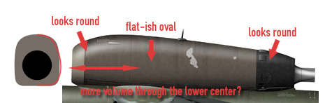
I feel the same way about the jet nacelle as Ink feels about your fuselage highlight. It looks to me like the side of the nacelle is a bit flattened like this-
If you could give it just a little more light and a more gradual fade from the lower center highlight edge I think it will round out really nice.
My shape isn't quite right and it's a little exaggerated but that's at least what I see.
Even with that, I think this is the best 162 profile I've ever seen!!!!
FAST AND BULBOUS!
Senior Member
First one is much better.
Ugo
Senior Member
Hi folks!
Thank you for the input! I personally like the first more. The engine will be reworked! Here is a nice reference pic showing good the light on the engine. http://www.kheichhorn.de/assets/images/He162_2.jpg I just will do it not so strong!
The fuselage is okay I think!
Update will follow!
Cheers
Senior Member
Hi Simon,Originally Posted by Baron

disturb me on many aircraft profiles, the sharp shadows of the wing, tail or other parts.
They draw but often very different from the actual mold from.
A good photographer elimiert for product shots so these "sun shade" through targeted spotlight
The bright light at the top of the engine cowling seems to me to be too strong.
This gives the panel a light rectangular geometry.
Here, I mean, you'd have to draw down a smooth light curve.
The tire of the nose wheel strikes me as too little about "like a balloon."
Round in the middle looks to the edges of.
Otherwise I think your drawings very well
Bye
Heli
flyingART for ever
Senior Member
Hi folks!
Here the reworked engine! Better?
Cheers,
Grand Wazoo
NICE! I still like the shiny version better but this is pretty hot!!!
By the way, full marks for indicating taped panel lines and rivets instead of showing them like most people do
FAST AND BULBOUS!
Senior Member
 Posting Permissions