Reply With Quote
AH! That's what I'm talking about

 Senior Member

Also look at Panchito in SPS Gallery?
Grand Wazoo
AH! That's what I'm talking about
FAST AND BULBOUS!
Senior Member
Thanks for your help,guys: it's very appreciated.
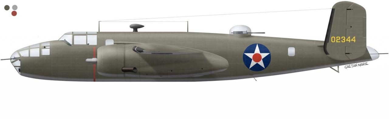
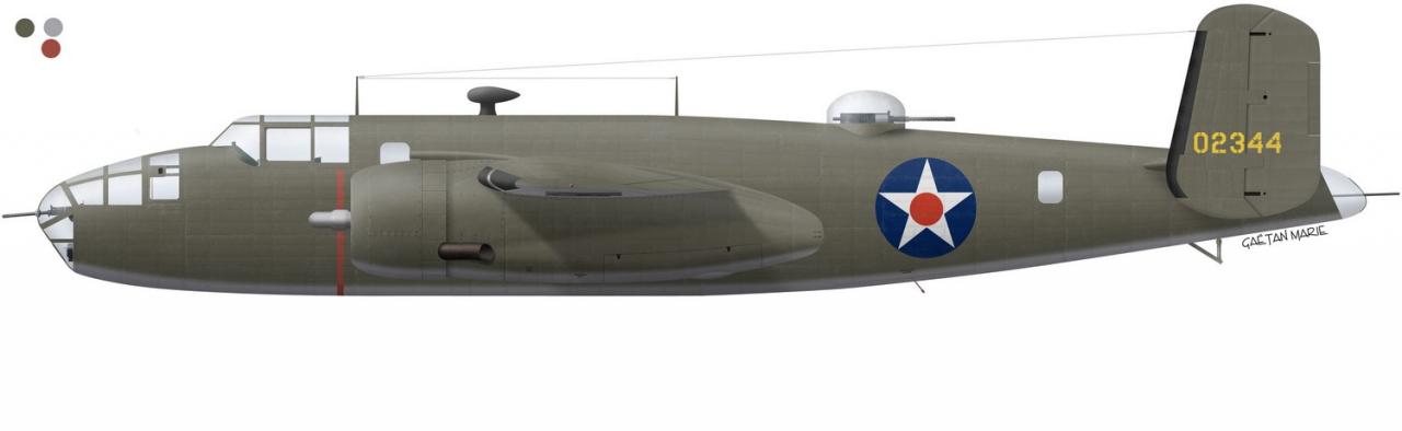
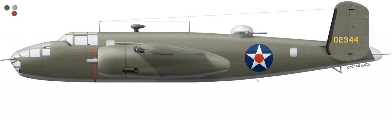
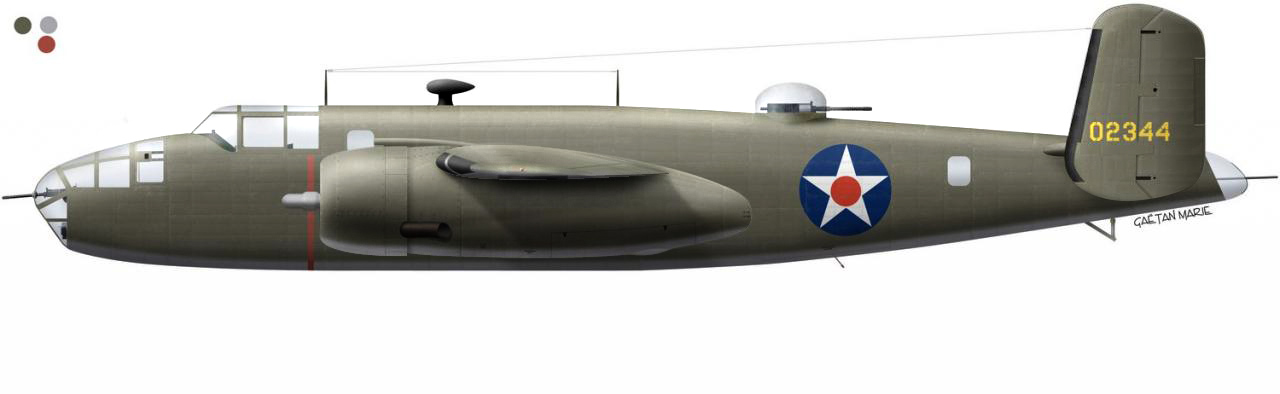
I've done part of the turret. I'll try and improve the canvas some and post on that later on. Concerning the lighting, here are three variants:
This is the "standard" one, which I've been using. Lighting is done using "linear light" mode.
This is a variant: the mode is "normal" and the light is just white. (I'm not crazy about this: it's watery and not very good-looking IMO.
This one is a mix: linear light + normal light at 50% opacity.
Maybe I should just continue using the linear light mode, but simply reinforce it? This is 110% linear light.
Which do you prefer? (I still prefer the 1st one, I must admit. I should probably should rework it more extensively than what I've done here :-( .)
Joe, you're right about the wing. It's been a problem since the beginning. Most artists who have done the B-25 have just made the underwing very black to avoid the problem. I'll see what i can work out.
Antipodean Pixelscratcher
Hi Gaetan,
With the wing, what would happen if you ran a highlight along the top edge of the tip to give it sone form? This may throw some foreshortening into the wing. Also, darkening the wing as it goes away from you might give a the same illusion of depth.
Better you than me!
Fuselage is looking good too. I'll have to try some of that panel bulging on my Sabre.
Senior Member
hi GM,
sorry to be a bearer of bad news, your outer wing panels are wrong, this is giving the wrong information to the eyes, check this works drawing, you have anhedral (negative dihedral) we should be seeing more of the underside.
JMSmith (back by popular demand)
Antipodean Pixelscratcher
I disagree, John.
The diagram is stating about 1/3 of one degree of negative dihedral (anhedral) for the outer wing panels which would put the centreline of the tip slightly below the centreline of the wing root at the nacelle.
I think Gaetan has got that spot on.
Graeme.
Grand Wazoo
Hey Ga?tan,
What I had in mind, right or wrong is more along the lines of adding to what you've got, not modifying it's effect. Of course this is more stylistic and also personal preference.
What I was thinking of was stronger more colorful highlights, and also stronger richer shadows. You're right about watery. The white highlight just makes it more white. I bet if you add another highlight on top of what you have, slightly sharper and less broad, and set it to "overlay", with adjustment of opacity, maybe 10 or 15%, you'll add color and your highlights will be much bolder and strong. Same with the shadows I think, although "overlay" might be too strong for the shadows.
Grubby's comment about pulling the wing out more is also a good point. I usually think like I'm sculpting a base-relief or even carving the shapes, add light and shadow to make parts advance and recede from the viewer. Not easy, but it can be done. The same goes for the nacelle and the horizontal stabilizer. Adding shadows and reflected light as well as higher top light is a good start. And what Grubby says about the foreshortening is also good although artist theory usually states objects get darker and stronger as the get closer. Both work of course, but I tend to think in terms of intensity. More intense as the object gets closer, so more contrast on the wing tip might work. But try Grubby's suggestion too, it depends on what fits the overall look you've established.
And, not like this is very good, only using the burn and highlight tools, but here something like what I had in mind-
And not like this has anything to do with shading but what about the blue of the national insignia? I would have thought darker even for the early pattern. I don't know either way but it's just something you might want to double check for accuracy. I think several changes were made with that color from pre war to very early war to a final color used later.
No matter what you decide, it's a really beautiful piece
FAST AND BULBOUS!
Senior Member
hi all,
here we go, did a quick drawing on top of GM's red lines are GM, green lines are where the leading edge should be and the wingtip with washout.
GM drawing as the leading edge at 10% anhedral believe it or not the green line is 0.33%.
JMSmith (back by popular demand)
Grand Wazoo
Washout, I hadn't thought of that, almost the whole wing tip is a washout on the B25 :P
FAST AND BULBOUS!
Senior Member
I see what you mean, John, although I don't really know if I have the courage to modify it...The drawing is late as I've been having monitor calibration problems (driving me nuts, but hopefully solved) and other priorities. I guess I will modify it.
You and Joe notice mistakes that nobody else does! I wish I were that careful and observing!
BH, thanks for your advice and time also. I always knew you were the light and shade god!
Last edited by gamary; 29th August 2008 at 17:30.
 Posting Permissions