
 Reply With Quote
Got the file, Otters (I replied in another thread, so I won't repeat here). Thanks a lot.

 Senior Member

Looking nice so far!
Senior Member
Got the file, Otters (I replied in another thread, so I won't repeat here). Thanks a lot.
Senior Member
hi GM,
looking very good, will study it in detail later, but nothing jumps out at me saying "wrong"
hey simon,
what the hell are you doing leaving that one unfinished, thats to good to dump.
JMSmith (back by popular demand)
Senior Member
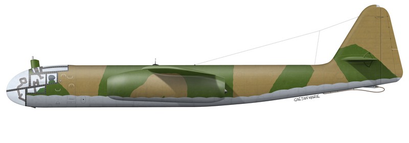
Here's another little update. Don't pay attention to the colour scheme. It's just a quick slap on I need. I begin with a 50% grey when I'm defining shape. Once that is done, I slap some colours on to create the weathering and have a better idea what the end result will be like.
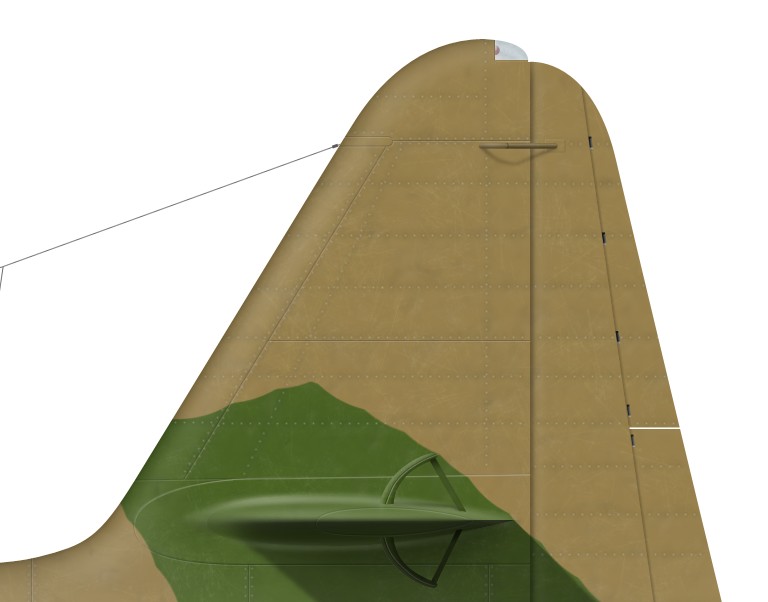
I'm experimenting some more with texturing. After having found a suitable "scratch" method, I'm now working on a "bump" method. Right now I'm working with two-scale bumping: medium/large bumps in the skin, and much smaller ones which aren't very visible but make the metal much less smooth. This is where I stand now:
(full-size sample)
I'm interested in any comments on this. The really cool thing is that I've made a "filter" out of these. So now, I only need to select the part I want to bump, and it's done automatically.Photoshop is so cool.
Senior Member
GM, Oh so very nice!!
Senior Member
Gammary
can we read about your technique somewhere?
Senior Member
can we read about your technique somewhere?
I'm not giving more detail ATM because 1?) I don't have time 2?) I haven't fully developed this technique and it will need some more work.
Senior Member
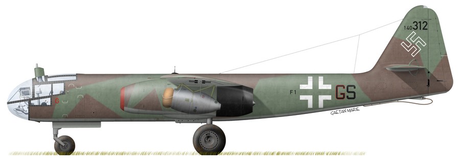
Well, she's now almost 100% finished. Only needs a bomb (those large SC 1000 if I'm not mistaken). Since this was a bit urgent, I had to do quick work with relatively poor documentation but I rather like the result. I think it looks good on wheels:
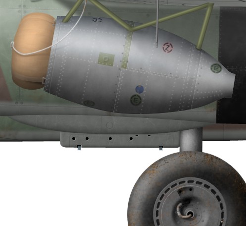
Doing the RATO pack was sort of fun.
John, open fire quickly if you need to: she's going to be published soon.I'd be interested in feedback about the colours (Simon?). As I understand it, nobody really knows what RLM 81 and 82 looked like, so I just chose colours that were in the range of possibilities and that seemed good-looking enough. I hope the results don't offend anybody's eyes.
@Peter, I hope my previous post was helpful (cc. the metal bumps). I know I'm only giving general indications but if you want more detailed explanations, email me.
Last edited by gamary; 28th October 2008 at 10:35. Reason: Blue.
Senior Member
looks great! you are very fast! detail work is amazing!
2 comments:
1. colours: The latest 2 books from Classic Publication about camouflage and markings are a great reference for the colours. What I do is I convert the colour chips in grayscale and check them with the reference pictures. Same I do with the colour profile. So it's possible to get a feeling what colours were used in the last months of the war. Check the contrast between the colours.
early built Ar 234 ofter were painted with RLM 70/71/76. Later 80/81/76 or a mix of all of these colours.
2. the swastika is wrong! have a look at my Ju 88 C-6 profile to see how an outlined swastika should look like!
http://www.simmerspaintshop.com/foru...htfighter.html
Cheers, Simon
Grand Wazoo
Looking pretty sweet Gamary!!!
I'd hold off on the swastika bit, at least as far as comparing it with the 88. The ONLY way to do it in this case is to check photos of THIS particular plane. Not other planes, especially earlier ones. That said, the proportions do seem a bit thin
One thing I'd work on are the rivets on the rocket pod. Notice they stay the same intensity in the high key areas as in the shadows. It would really pick up if the intensity of the rivets increased and decreased with the shadows and lights.
I really like the look and finish, but... But what about a higher sheen? These were supposed to be semi gloss I think. Can you see that in war time photos? No books here at the moment, I'm at work :P That's something to think check into.
Cation about the greyscale thing, converting color to B&W on a computer, making B&W Xeroxes, etc, can never come close to what actual film does. At best, it's just another way to arrive at a guess. The contrast that you get with real film is so much different than with conversion to greyscale on a computer screen, MUCH less contrast with greyscale. Plus, different film stocks, use of filters on the lenses and filters and paper used in making the photo print make for too many variable to be able to account for accurately.
As long as that is kept in mind. There's nothing wrong with checking that way but it's not a safe way to make any definitive decision.
No offense Baron, you're probably aware of this, but not everyone is. It's always good to add a disclaimer to anything when you're interpreting B&W photos
FAST AND BULBOUS!
 Posting Permissions