

 Reply With Quote
Nice try BH. Try darkening from the centre of the wing root outwards.
rat.

 Grand Wazoo

Don't go that far, I'm not that importantdefend your right to an opinion to the death
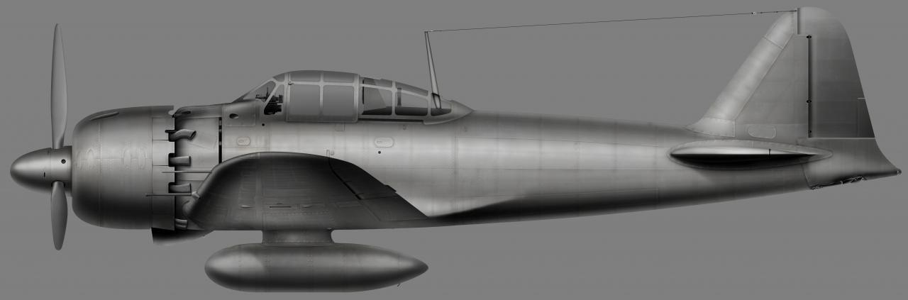
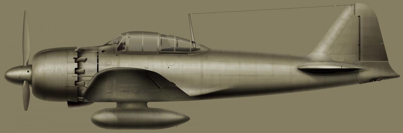
Just to check this from all angles, I did the color field thing. If anything, the way I did my shading to compensate for the lighter and darker colors on the plane may not be working as good as I hoped but considering the variation from light tan to dark green to black it seems pretty well balanced as a single color study.
Here it is at 50% gray. You can see some parts are a bit dark while the highlights are a little blown out-
The wing underside looks PLENTY dark to me. The drop tank might be too light though.
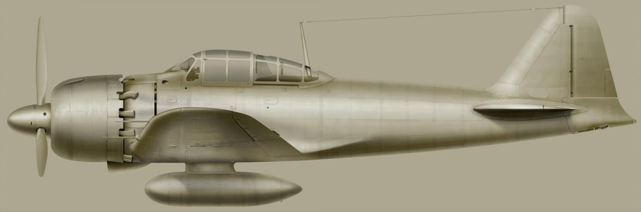
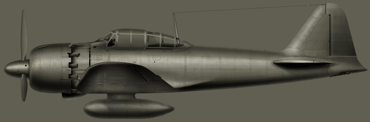
With the light IJN base color none of the shadows seems to dark and the wing and drop tank do look a little light-
A medium ocher looks more reasonable, but the wing actually looks a little too dark to me-
With the IJN green the highlights are too strong as are the shadows-
I might want to adjust that green some, it's looking a smidge anemic! I noticed the earlier Zeros I did are MUCH brighter!
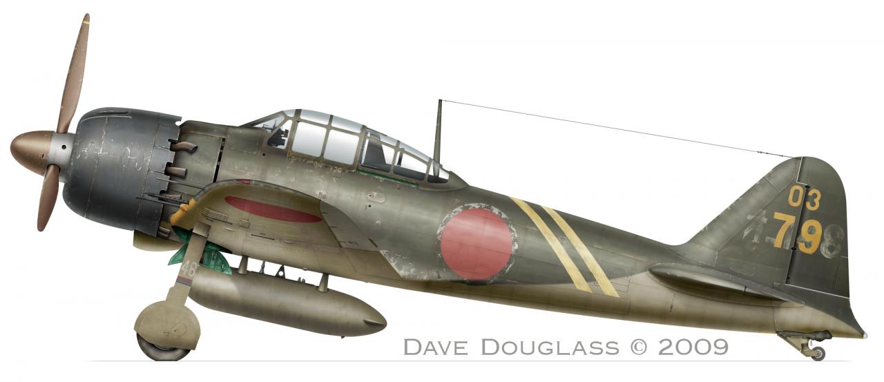
http://home.earthlink.net/~dougzeug/...173_shindo.jpg
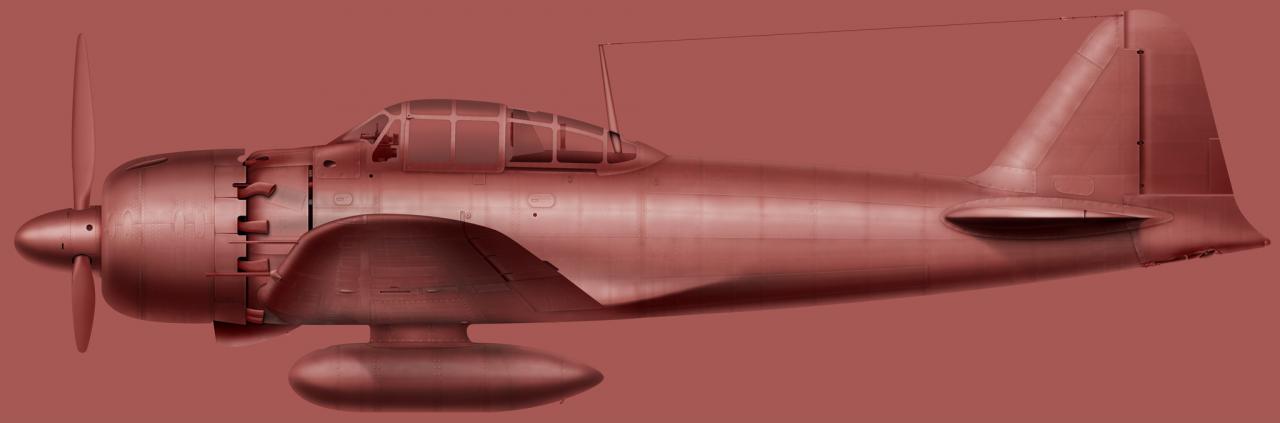
And just fore fun-
What say you now Rat?
Last edited by BLOWHARD; 24th January 2010 at 22:55.
FAST AND BULBOUS!
Senior Member
Nice try BH. Try darkening from the centre of the wing root outwards.
rat.
Grand Wazoo
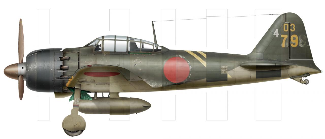
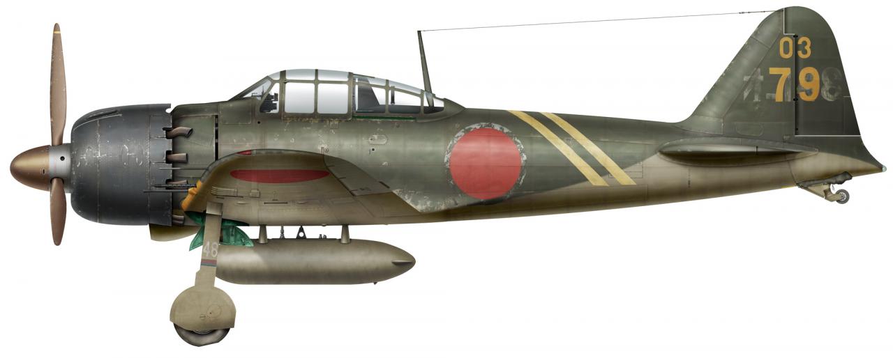
Another one, last of the line, the model 52c-
Lots of changes on the one from the 52b, you betcha
FAST AND BULBOUS!
Senior Member
beautifull BH,
still think the scale effect on the colours is to strong, but that is just my way of thinking
JMSmith (back by popular demand)
Senior Member
The Zero has a wealth of character, with the warn paint, chipping and staining, you certainly bring out the best of that character in your art BH.
Grand Wazoo
Thanks Jester
You may have something there JM. I still think my new planes look right...BUT...and that's a BIG BUT...
I opened some of my original Zeros from 07 and compared the color. The older ones are indeed much richer and a also darker. I must have been getting lighter all along
Here a comparison-
Now I'm wasting expensive paper and ink printing samples at various setting trying to find where I really need to be with the color rather than what looks good on the screen.
This looks terribly dark on my screen but it prints nice. What does it look like to you guys???
FAST AND BULBOUS!
Senior Member
hi BH,
looks good to me, but, and this is a BIG but, it depends on how it prints, if it looks right printed then thats ok, setting profiles for printing is totally different than doing it for the screen
JMSmith (back by popular demand)
Senior Member
Doesn't look too dark to me.
Keep in mind that when it's printed somewhere else it will look completely different as well.

Senior Member
The lower one looks better to me - it has better contrast.
Mierenneuker
Oh no Blowhard you are about to enter the Monitor/printer calibration zone. Expect some headaches and a never ending expenditure on printer cartridges dude.
Clint
 Posting Permissions