Reply With Quote
Hey Simon, all very good points you make, or at least ones worth discussing.
I have to preface the rest of this by saying what everyone here needs to remember; what we do by "profiling" aircraft can NEVER exist in real life. An object can never be viewed as flat across a surface. It will always be in perspective.
As profile artists we're breaking really important rules of visual art. It's very important to remember this. Once that rule of perspective is broken, all rules go out the window. It's up to us to assemble them in a way that has some sort of valid visual consistency.
There is a range from very simple devices to very convoluted ones to show three dimensionality. Obviously the more complex you get, the harder it is to hold everything together.
I am a firm believer that once the realistic rules of visual perspective are broken in order of us to paint profiles, none of the other rules are valid, or one more valid than another. It becomes an exercise to show form, depth and contour with whatever devices we have.
OK, point by point-
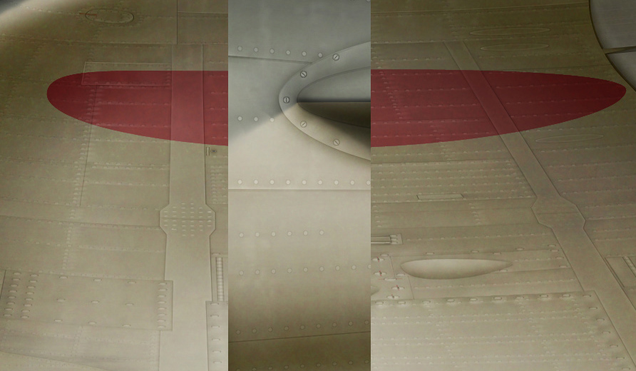
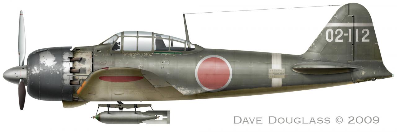
I think the lighting and coloring are pretty different myself but maybe I could push it more? I didn't want to get too clever with light shift, after all, these profiles are to show color and markings. If I went in a more impressionistic direction and picked up some blue or purple under the wing it could confuse the issue of what the base color is.On your drawing the underside is lighter than the same colour on the fuselage
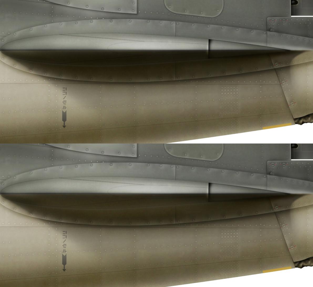
Here is my wing compared to the fuselage-
Maybe it needs to have a warmer richer look to set it aside more? But you can see a difference in color and lighting pretty clearly I think.
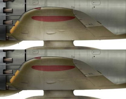
More so, we're talking about two different reasons for shading. Every artists learns that the light source isn't the only way we see form and contour in an object, there is also foreshortening, the effect of the object as it occupies space and how our eyes interpret it. You can either show an object and light to dark or dark to light to show perspective independent to lighting. Generally to show a close object, it becomes darker and more intense in color and gets lighter and less intense as it recedes. This sort of shading has little to do with directional lighting, it's a device to show proximity and volume. I want the wing to pull away and extend from the fuselage, after all, it isn't on the same plane as the fuselage, it should appear to come out of the viewing surface.
In a case like the wing I've got 3 choices, either show extreme shadow darker than the object it sits on, to show reflected light pulling it off the dark object it sits on, or to imply different color of light, cold against warm, or warm over cold or a shift from warm to cold etc. ...or a combination of those.
No matter on whether it's "correct" in a technical sense, the reflected light does have the effect I want, it pulls the wing away from the dark fuselage and it shows the airfoil contour and volume the wing along with it. You'll notice the wing does get darker as is gets closer, also implying lighting perspective; the object gets darker as it gets close, and it also shows the decrease of the airfoil to a more flat shape.
This is all simple art theory.
Your wing shading is valid of course, but notice how it tends to flatten the wing out, it no longer shows the airfoil curvature as strong and the wing itself flattens out on sucks into the image, much like using a small lens aperture on a camera. No depth, or not as much.
Also notice mine seems more weighty, it has more presence.
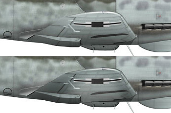
Another example, your 109. As I said, yours is fine as is. But here is what I would have done. It is a different circumstance to the Zero so the shading is a bit different.
Mine isn't better or more valid, it just shows the volume and depth differently.
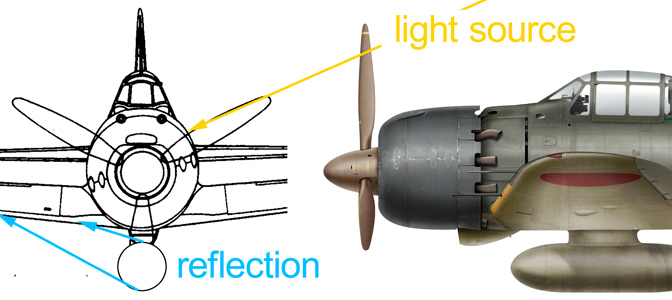
The color of the ground is reflected more strong, true. but also the darkness of the planes on shadow is reflected. The further it is away from the ground the more pure the light will be. And object in sunlight doesn't become darker underneath when it is separated from another surface, it gets lighter. At least half the shadow under an object in sunlight is caused by it's own shadow reflected back. True, certain types of sunlight can produce dark underside shadows but in fully diffuse sunlight the light wraps around objects and bounces back from every direction.You just have these reflection effects because the planes stand on the ground. If the plane is "in the air" there can't be any of these reflections.
Light isn't only reflected off the ground, like as in a plane sitting on the runway. From space our planet is a point of light, the whole planet reflects light. But more to do with this example, the whole earth reflects light, as do the clouds, dust and moisture in the air, not just a strip of ground the object sits on. Again, not only light is reflected back on the under surface, but also the objects own shadow.
The sun isn't under this plane, it is in front, roughly the same height as it is on my profile. Pure reflected light. The sun reaches objects from all angles unless it's blocked by another object, and then the amount of shadow is dependent of the proximity of the object blocking the light.
This is a good point, I never worked this all out in my head. It was my idea that the light source in my profile is not directly from above, but and an angle above the viewer. Notice the strong highlight across the fuselage?Also should the tank" make a shadow on the wing. (in your theory).
What I had worked out was that the light source would cause a reflection on the opposite side of the wing.
I think this is true but I never completely worked this out so I'm not 100% sure. Just the fact that the plane is slightly glossy should dictate that some reflection would show. For me, this would muddy up the picture in a way I don't want. But maybe I should rethink it?
One thing I should rethink is the shading on the tank itself. I had always felt I should have a stronger shadow on the top edge of the tank and a less strong shadow under the tank. I don't remember my exact thinking, it's more than a year, almost 2 since I did the first profile, but I think the idea was that showing the reflected shadow of the underside of the plane as a strong shadow on the top of the tank would be confusing pictorially, so I went with the usual lighter top/darker bottom. I'm going to experiment with this some. I do believe the lighting on the forward part of the tank is ok giving the direction of the light.
More simple shading. We all do it on our fuselages, even you do Simon.Why is the shadow of the horizontal tail unit so dark?
Why is the top of the fuselage always shown dark? To show that the top of the shape is receding in space, as it does so the color and intensity is compressed so we show shadow. It's on the top of the plane, shouldn't it be lighter? Maybe so, but it wouldn't pull the fuselage off the surface. If it were light it would blend. Same thing with the tail-
To show an object receding away from the eye and compressing in space, you can either show the object as going completely light or completely dark. I this case, underside of a plane as well as extreme foreshortening, dark is it. Plus, shadows and lighting aren't constant, the proximity of an object to the thing the cast a shadow dictates the strength or weakness of the shadow. The drop tank has quite a bit of space between it and the underside of the fuselage. The horizontal tail is in direct contact with the fuselage, the reflection of the fuselage bounces back up into the wing and makes it necessarily darker.
Mine might be to dark but in my own defense, I only have so many pixels the get the whole length of the horizontal tail compressed within
You can see I have the underside shaded like the wing but within the limitation of the space and the differences of the angle and the reflected light.
But perhaps I should show more center volume light as well as light picking up the tail fillet contour?
Anyway, that's why I did what I did, right or wrong. But it's good to revisit it and rethink the reasons.