Page 2 of 9 FirstFirst 1 2 3 4 5 6 ... LastLast
Results 11 to 20 of 81
  1. #11

    Re: Apology up front.

    Looks good to me. I realize this is a restored BF109 G2 but is the paint scheme based on an actual combat aircraft?
    Last edited by fritzie101; 9th October 2009 at 23:46.
  2. #12
    Join Date
    Jan 2008
    Location
    Edmonton, Alberta CA
    Posts
    946
    Downloads
    0
    Uploads
    0

    Re: Apology up front.

    If there are problems with the painting, it will be my fault and not Jester's. This has been a very long project (several years at least) and every time we think we've got it spot on, something else crops up. I can't think of how many layers Jes has to go through to fix up the base drawing every time I change a line, but we both want it done right.

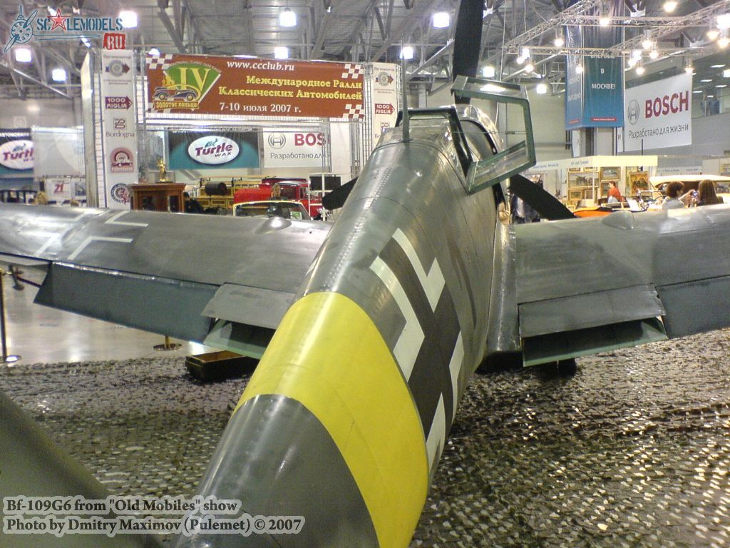
    This aircraft is a real chameleon. We can't even pretend to know what was in the minds of the manufacturers and ground crews during development and final phases. There are so many variables that both Jes and myself are ready to have ourselves committed. We've already accepted the fact that we'll never be 100% right, but we can get damn close and that's what matters!

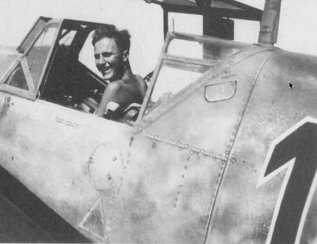
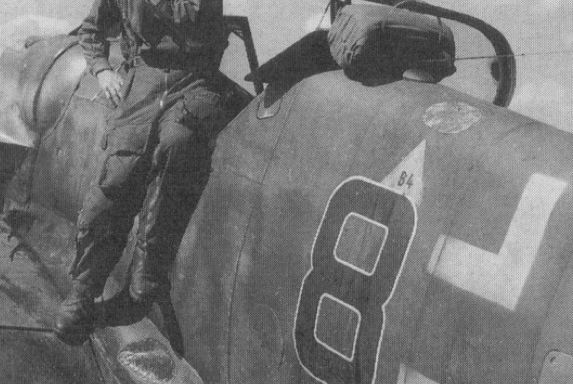
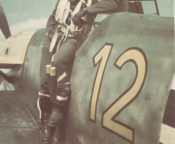
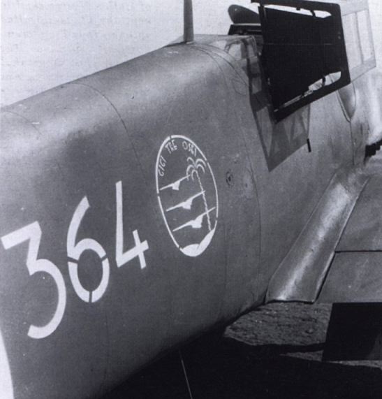
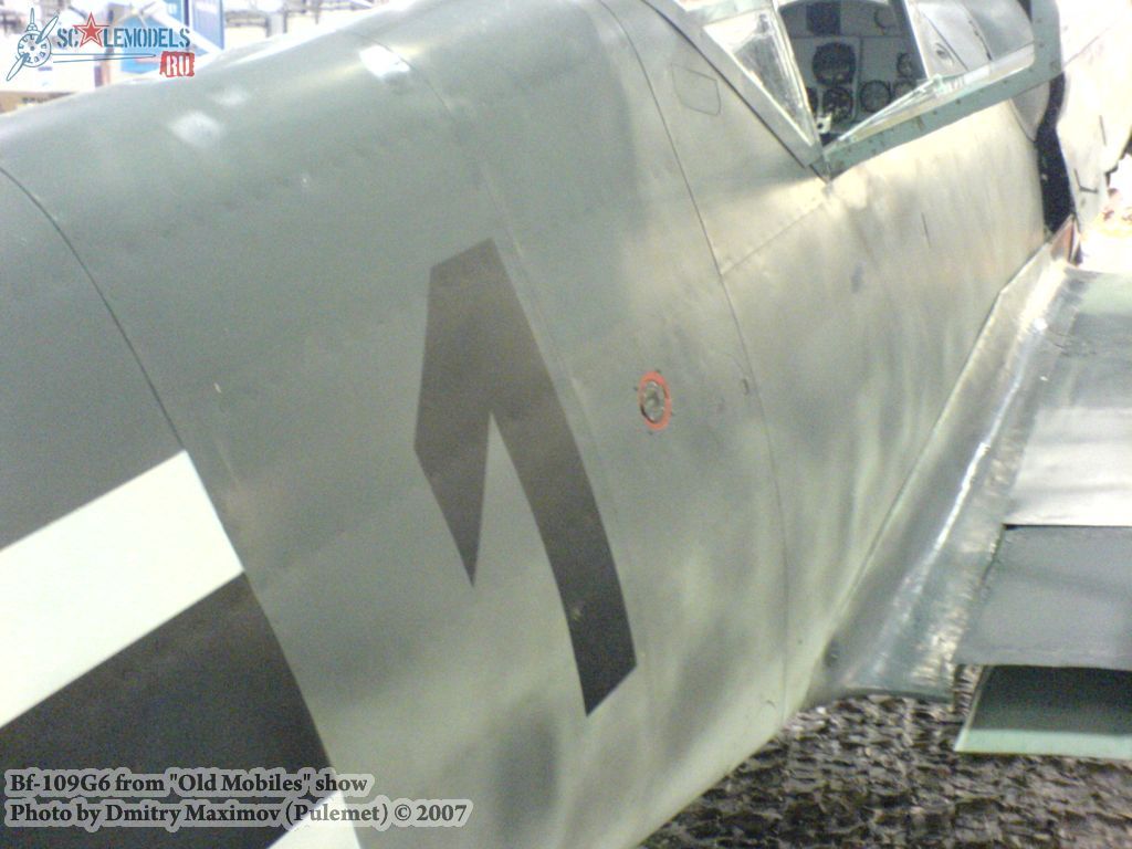
    @BH: This thing was notorious for oil leaks through all versions. A one hour flight and it looked like crap. Soot and oil settled in every crevase from nose to tail. Crews tried to clean it as best as they could, but it's like grease under a mechanic's fingernails. You can shower all you like, but it never goes away. I think Jes hasn't dirtied it up enough, but he's the one doing the colour and has to do what he feels is right. Most WW2 photos are kinda washed out, so I don't think he's very far off the mark.

    More to come as the series unfolds and Jester gets his sanity back. He may be permanently on Prozac since meeting me.

    Cheers!!!
    Otter
  3. #13

    Re: Apology up front.

    Oh no, not dirt or oil, it's contour. It just looks a little much to me, especially through the black of the cross. Most photos show less, about half as deep or strong or whatever. In all the photos I can find that show this area clearly it's far less exaggerated.
    Just my opinion, it still looks good, just too much

    FAST AND BULBOUS!
  4. #14

    Re: Apology up front.

    OK, I'm hooked. I just went through all the photos on my computer. (I'm too lazy to scan right now)
    I found a few interesting pictures, some show really smooth sections and some not.

    The dirt we all know about, notice the small rolled effect where the sections meet, almost a raised bead-
    Name:  109_fuse_1.jpg
Views: 285
Size:  59.0 KB

    Next two are smoothies-
    Name:  109_fuse_2.jpg
Views: 279
Size:  44.6 KB

    Name:  109_fuse_3.jpg
Views: 282
Size:  39.0 KB

    This smashed one shows the most wrinkles and creases I can find-
    Name:  109_fuse_4.jpg
Views: 278
Size:  50.3 KB

    SMOOTH!
    Name:  109_fuse_5.jpg
Views: 279
Size:  39.7 KB

    This one is the closest to the effect Jester has-
    Name:  109G_detail_1.jpg
Views: 288
Size:  238.7 KB

    This last one is really messed up, but notice the rivets seem to make as much of a crease as the joined sections do-
    Name:  109_fuse_6.jpg
Views: 280
Size:  70.3 KB

    FAST AND BULBOUS!
  5. #15

    Re: Apology up front.

    ...and then I moved on to restored planes-

    Slight creases-


    Very smooth, much like the smooth wartime photos I posted-


    Again, notice the rivets are deeper than the section joins-


    Close to Jesters, but still more understated IMHO-


    The next 5 are more like what I'd expect, pretty smooth with slight variations-


    What's my point? I guess anything goes but I still believe that showing a strongly creased fuselage would be a mistake.

    STILL, it looks really good...just sayin'

    FAST AND BULBOUS!
  6. #16

    Re: Apology up front.

    Wait a sec, I had another point, this thing is so damn perfect it's worth arguing over small details like this. It's too good to stop now

    FAST AND BULBOUS!
  7. #17
    Join Date
    Nov 2007
    Location
    Ellistown UK
    Posts
    2,089
    Downloads
    0
    Uploads
    0

    Re: Apology up front.

    hey BH,

    the greif i gave him yesterday nearly sent him to the asylum, just because one little line was not perfectly flat he rectified the problem in the end.

    come on jester, we are all rooting for ya
    JMSmith (back by popular demand)
  8. #18
    Join Date
    Nov 2007
    Location
    between tedium and apathy, with an occasional sidetrip to monotony
    Posts
    1,120
    Downloads
    0
    Uploads
    0

    Re: Apology up front.

    Jester, did the fact that, Red 7 (D-FWME) is a reconfigured Hispano Buchon and not a genuine 109, make any difference when you chose to illustrate this livery?

    I understand that there a quite a few subtle differences between the two. Not that I could tell the difference.

    And where's the can of worms emoticon.
  9. #19

    Re: Apology up front.

    There are that many little changes on red 7 from war time 109's I decided to make it its own template.
  10. #20
    Join Date
    Jan 2008
    Location
    Edmonton, Alberta CA
    Posts
    946
    Downloads
    0
    Uploads
    0

    Re: Apology up front.

    BH, stay out of the sun. You don't tan, you burn which explains the grimmace on yer face. The "rolled effect" yer referring to is the result of the panels having an L shaped flanged lip on them. The panels weren't butt joined but fitted one under the other. There's a very specific order in which they were installed. The panels were riveted not just to the ribbing, but to each other as well for strength, and that's why you don't see a rivet line on either side of the seam.

    @GFR: Yer right, there's a lot of subtle differences that you won't notice from a distance, but up close you notice right away. Others you won't see even from close up unless you crawl underneath the plane where the wing center section has been altered quite a bit. In the example shown below of FM+BB, look at the windsheild cleaning line. This is a Spanish addition. Immidiately below it are two lines of rivets which were not present on German machines. Note also the two circled scoops which I'm assuming the Spanish added for more cockpit ventilation.

    In the example of Red 7, it also has the additional two rows of rivets. They've removed the proper cleaning line entirely and in it's place they've left a series of rivets on the forward frame. These are for mounting the cockpit LED lights and on German machines these were mounted from the inside and therefore not visible. The last shot is the nose area of Red 7. No German machine ever had a chin scoop shaped like that. All kinds of little anomalies like this are why you can't trust restorations for accuracy.
    Attached Images Attached Images      
    Last edited by Otterkins2; 12th October 2009 at 00:05.

Posting Permissions

  • You may not post new threads
  • You may not post replies
  • You may not post attachments
  • You may not edit your posts
  •