Page 4 of 9 FirstFirst 1 2 3 4 5 6 7 8 ... LastLast
Results 31 to 40 of 81
  1. #31

    Re: Apology up front.

    it looks far worse on the thumb than it does on the full count
    I always thought it looked bad on the real planes but those guys didn't listen too me before the glopped paint all over that yellow!

    I think Jes is cooking here though the spots may be a bit harsh
    Well, let's see the photo. That's the proof. Some of those spots are super soft, although they didn't have gaussian blur filters during the war, and others were aggressively hard. It's all up to the photos and the interpretation of them

    On White 2, wouldn't the spot on the rudder have been red-ish inking?" Or something like that? Or are you interpreting it as something else? Or is it just a guess? ...OR...

    FAST AND BULBOUS!
  2. #32

    Re: Apology up front.

    These are my interpretations and by no means should be taken as correct.
    All the info is there, it’s a question of what each person sees.
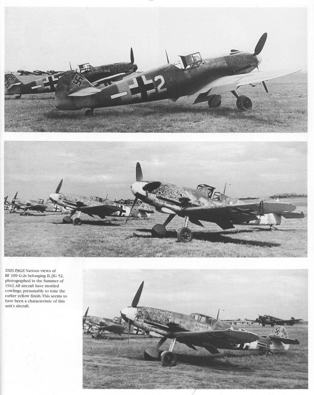
    The book these scans are taken from (thank you Otter) depict the national markings on “white 2” as black and white standard, but from the photograph you can see that the bars behind the markings are black, so how can the national markings be black? One person will see it one way, others will see it differently. The blotch fest on the nose of Stenoff’s plane might have been applied by hand using a rag and a pot of paint? I think the size, weight and the hardness of these are spot (no pun intended) but maybe the frequency should be increased in some areas. The photo I have to work with for Stenoff’s plane is a postage stamp, so I’m giving myself a pat on the back for getting it this close Keep looking guys, many eyes see many variations.

    @BH, I started the repair patch as a good solid red prima brown, but knocked back with layers of weathering to tone it down, it looked too fresh to me. It might need to be brought forward more?
  3. #33
    Join Date
    Nov 2007
    Location
    Ellistown UK
    Posts
    2,089
    Downloads
    0
    Uploads
    0

    Re: Apology up front.

    hi jester,

    the underwing one, you know the one ya did on the top image

    but that don't excuse the underwing cross problem we discussed
    or do i come round there with the truck and drive some sense into you
    JMSmith (back by popular demand)
  4. #34
    Join Date
    Sep 2008
    Posts
    681
    Downloads
    14
    Uploads
    0

    Re: Apology up front.

    great artwork jester!

    just miss more weathering!

    cheers,
    Luftwaffe Aviation Art
    made by Simon Schatz
    http://luftwaffe-aviation-art.blogspot.co.at/
  5. #35
    Join Date
    Mar 2007
    Location
    France
    Posts
    2,343
    Downloads
    0
    Uploads
    0

    Re: Apology up front.

    Jesters has a clean style which I like. I don't know if too much weathering would necessarily suit it.

    I guess that's your call, JI!?
  6. #36

    Re: Apology up front.

    It might need to be brought forward more?
    I had almost thought you were doing a faded version of RLM 81 Maybe put a touch more red-orange back into it? Or is it my screen?

    I don't know if too much weathering would necessarily suit it.
    IMHO the weathering should match what you seen in photos. If the plane you're painting is clean, why make it weathered? It's one thing if you're speculating but another if you're using photos as your primary source.

    FAST AND BULBOUS!
  7. #37
    Join Date
    Sep 2008
    Posts
    681
    Downloads
    14
    Uploads
    0

    Re: Apology up front.

    Yes BH! Weathering should fit to the reference photo.

    I have just compared White 2 photos with the profile. The plane is really dirty and the profile is clean. Look at the crosses on the fuselage and the tactical number 2.

    I know it's just a test for Jester. But If you can't find any other "mistakes" I had to note that. BTW: I also like Jester's style. First if all the way he does the lights and shadows.
    Luftwaffe Aviation Art
    made by Simon Schatz
    http://luftwaffe-aviation-art.blogspot.co.at/
  8. #38
    Join Date
    Nov 2007
    Location
    Ellistown UK
    Posts
    2,089
    Downloads
    0
    Uploads
    0

    Re: Apology up front.

    right gentlemen,

    play time over, jesters second profile is of Steinhoff's machine, has anyone proof that the top engine cowling was painted yellow, and i don't mean Kageros part profiles showing this, i mean a wartime image.

    the only ones i have found show the cowlings painted rlm76 hellgrau, then spotted with a dark colour ( name the one of your choice)

    if you have a image (jester included) please give your case for it being yellow.

    jester my friend, sorry but you would not speak to me of site, so i could not give you advance warning.
    JMSmith (back by popular demand)
  9. #39

    Re: Apology up front.

    show the cowlings painted rlm76 hellgrau
    Huh? Are you sure? You can see it in the photos and tell it's not yellow?
    Those two colors could look identical in B&W.
    I've seen plenty of color art and references that shows 76 but that makes little sense to me. Many, or even most of those planes had all yellow noses. The the long standing interpretation says the yellow was overpainted to provide better camouflage on the ground. It might not be any more correct than 76 but seeing as though all yellow cowlings were horribly common and 76 cowlings are so rare that I've never seen or heard of a standard camouflage 109 with an all 76 upper cowling, that yellow with overpaint is most likely correct. And this idea has been around A LONG TIME before Kagero started publishing books. The idea of 76 with mottle overpaint is fairly new I think, past 10 or 15 years maybe?
    Name:  109_jg52.jpg
Views: 164
Size:  155.7 KB
    If you have a whole bunch of planes with yellow cowls and then later you see the same or similar bunch of planes, same unit, with dark mottle over a light colored cowl, "presumably" is a better guess than something that doesn't fit a logical progression.
    Unless you've got a primary source, like artifacts, combat reports or pilot remembrances, I think yellow is pretty likely, or at the very least, as plausible as any other color.
    But if you're using decal sheets or Mark Styling as your primary reference, you've got another thing all together.

    So, only going on B&W photos, no profile art, and knowing the history of the planes, there is little evidence to say the color was anything other than yellow. It's still a guess, but anything other than yellow is way out in left field.

    BTW, I found the scanned page pretty quick, in the first book I picked up. I can find more but I didn't want to spend the rest of the evening looking through books

    FAST AND BULBOUS!
  10. #40

    Re: Apology up front.

    No its quite alright John, everyone is entitled to take a shot at this.
    I’m kind of with BH, I’d go with yellow, seeing as it was a much more common colour for 109 noses, but my main reasoning was based on the fuselage band and bib being yellow (also having an identical tone value). This will always be the problem with drawing profiles of aircraft pre colour photography, best guess has to do most of the time.

    I don’t take anything for granted, but the more sets of eyes that look at it, the broader the perspective of opinions can be gathered. Sensibly (I’m going out on a limb with this word) I know the simmers community can come up with something consistent, believable and best of all most likely. The photo I was working from was about a quarter of the size of BH’s example and about half the quality and although I want to make some changes having seen the new pics, I think it is very close.

    I said this along time ago…..drawing is 90% looking and 10% drawing. The harder you look the more you find and it never ends.

Posting Permissions

  • You may not post new threads
  • You may not post replies
  • You may not post attachments
  • You may not edit your posts
  •