Reply With Quote
Nice job Sir!!

 Senior Member

Nice! I'm looking forward to the low and dirty ones.
Given the complexity of the job, you've done real good. I don't think I'd dare do such a... thing.
Last edited by gamary; 13th January 2010 at 21:57. Reason: John
Senior Member
Nice job Sir!!
Ugo
Senior Member
I agree with gamary and Ugobravo! JMSmith

Antipodean Pixelscratcher
Outstanding work, Mr Smith! You can officially Walk the Walk and Talk the Talk!
Grubby.
Senior Member
THANK YOU KIND GENTLEMEN!
but if you think i will go easy on your work, your barking up the wrong tree
no seriously, if ever i get anywhere near as good as you guys i will be happy, i ain't even good enough to lick your boots.
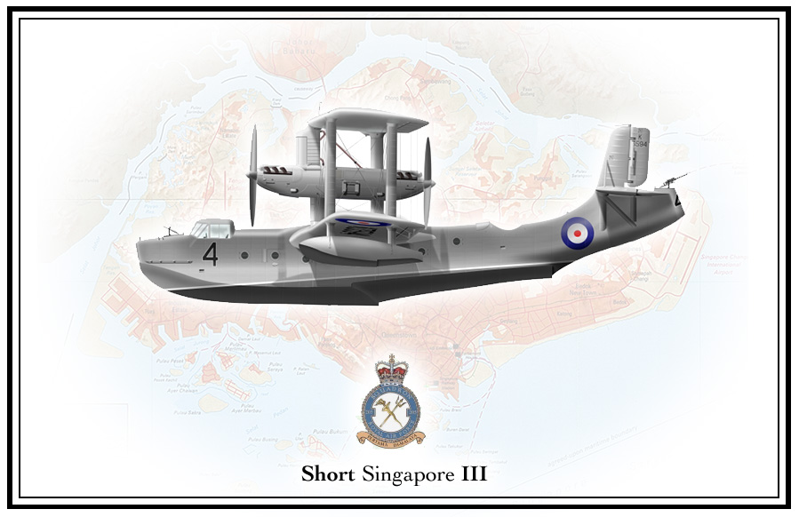
i am at the hard part, mounting the damn thing, this is the lines i am thinking of, what do you thing, really need to get this done quick so it can go of for test printing whilst i am sunning myself in the budgie islands
JMSmith (back by popular demand)
Mierenneuker
Something like this John perhaps? Bit more balanced? Typeface is Cochin Bold let me know if you are wanting? You lucky man I need a holiday badly.
Clint
Last edited by Clint Mitchell; 16th January 2010 at 20:05.
Senior Member
hi clint,
talk about think alike, here is the rough draft of my new version, with many thanks to VT for the help
as you guessed i ain't very good at this bit, the first one i tried on the Spearfish they told me i needed a lawnmower, just cus i added a bit of grass
the two crest are 205 sqn and Seletar airbase, with a couple of faded out images of the actual aircraft, the box will contain info about the aircraft
i will submit your version and mine to the man and let him choose
Last edited by JMSmith; 16th January 2010 at 21:23. Reason: it's saturday and GM needs something to read
JMSmith (back by popular demand)
Mierenneuker
It's all to do with the great minds John.
Clint
Antipodean Pixelscratcher
John, if I may, be careful your border and your title block don't overpower your drawing. When I first saw your first pass, my eye was drawn straight to the border, not the illustration.
Likewise with the second version.
My suggestion would be to colour the border one of the medium grey shades of the drawing. This will then accentuate the drawing, rather than pull your eye away from it.
Likewise, I'd like to drop the intensity of the map by 25-50%
Grubby.
Senior Member
Woohooo, I get to tell you something for a change.
I took the liberty( like everybody else it seems) to fix some of the alignment issues that your print had. Its the designer in me, I cant help myself.
Like with a profile, subtle changes make all the difference.
 Posting Permissions


")