
 Reply With Quote
Very nice!!!


 Senior Member

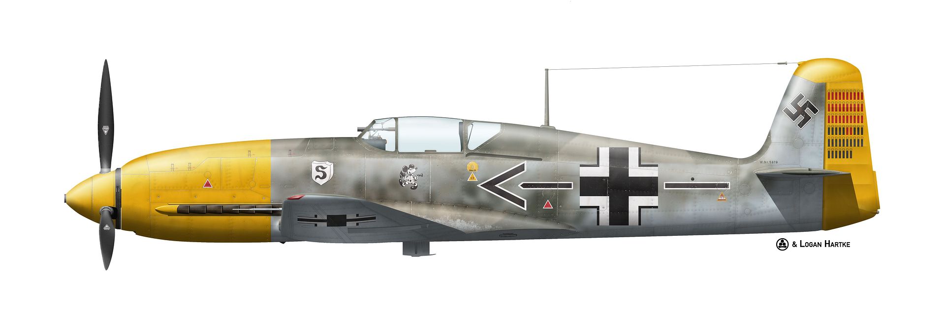
Well, here is the Heinkel He 100 I've been working on. It's not quite at 100%, but it's big enough to make out almost all the detail.
What do you guys think?
Cheers,
Logan
Grand Wazoo
Very nice!!!
FAST AND BULBOUS!
Senior Member
It was actually a cigar holder, wasn't it? And if it's out of view, sure! It has it!
Cheers,
Logan
Senior Member
Nice details, but I cannot help myself. I do not feel the roundness form the body...and the rivets or the dirt lines under seems a bit too much for me..gives effect of crappy pannels . but its only my impression.
Peter Kassak
Senior Member
I see what you've done with the panel lines and understand the method behind it, makes perfect sense. But as pkassak says it doesn't look quite right, I'd persevere with this but try playing around with it a little.
Looks a lot better at full size and I love the texture on the rudder, but the fuselage does lack some depth.
Great what if scheme, are you planning more, North Africa for example?
Harriers...uppy downy things.
Senior Member
also one minor point, shouldn't the cross under the wing be less visible due to the angle and shades etc ? It has the same intensity as fuselage marking. I personally give it on 70% of full intensity...
Peter Kassak
Grand Wazoo
About the panel lines and rivet lines; this is always a problem. To adjust them to look good on light colors and dark colors is a complicated balancing act.
After reading the comments so far, that is probably the problem here. I think the surface detail looks great on the areas with the upper camouflage and mottling but that maybe it stands out a little more on the yellow and 76.
Maybe all you need is some careful adjustments with this issue. I made numerous adjustments with the Zero using many complicated an devious methods
So far, the Albatros isn't so much trouble but I did need a few tricks to make these sort of adjustments.
FAST AND BULBOUS!
Senior Member
That's fair. As you can see here in the "build thread" I made for it, I kept going back and forth between about 70% and 50% opacity on the shading. Apparently I ended at closer to 55%, which I don't think was enough.Originally Posted by pkassak

Adolf Galland's He 100D-2/N Build Thread
Take a look at the updated image in this post.
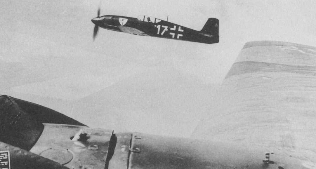
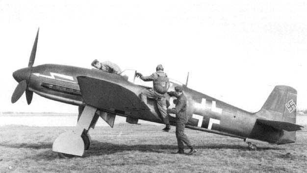
As for the dirt, I don't think it's really all that much compared to the shots of Galland's 109 that I looked at, but the scaling of it from 100% results in some things being out of proportion once scaled down.
Yeah, I wanted to give the impression that the fabric covered rudder was really fabric. Thanks for noticing it!
I plan on doing some North African ones eventually.
Hmm, I think I understand. I don't think it needs to be too much, though. See these photos.
I've given it about 20% gray overlay. See the updated image in this post.
I've updated it some based on the comments. What do you think? Too much shading this time? Did I pull the weathering back too much and throw the baby out with the bath water?
I hope this looks a bit better. Thanks for the advice!
Cheers,
Logan
Senior Member
very nice!
Senior Member
I think its better
Peter Kassak
 Posting Permissions