

If you are not familiar with using paths please see this tutorial-
Vector Tutorial
(wasn't there a pen tool tutorial here at Simmer's?)
Also, before you begin here, make sure you see Adlabs gauge making tutorial here-
http://www.simmerspaintshop.com/foru...read.php?t=471
So, now you know a bit about using the pen tool to make vectored paths and have an idea of how to build gauges. Now comes the hard part, duplicating strange and often hand painted numbers and letters found on real aircraft gauges. These unique fonts are very important to the look and feeling of these vintage instruments. If you want an accurate look, you'll just have to do the extra work and give up on available fonts. It doesn't matter how many fonts you have, you never find a font EXACTLY like what you'll see in most WW1 and WW2 aircraft gauges.
One solution to this problem is to use the pen tool and draw the fonts by tracing around an actual photo. But even easier is to find a font that is close and then convert it to paths. That path can then be infinitely modified until it is as close as you feel necessary.
Step 1
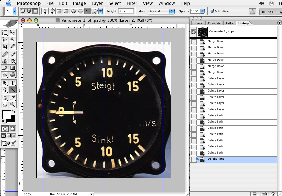
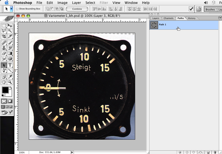
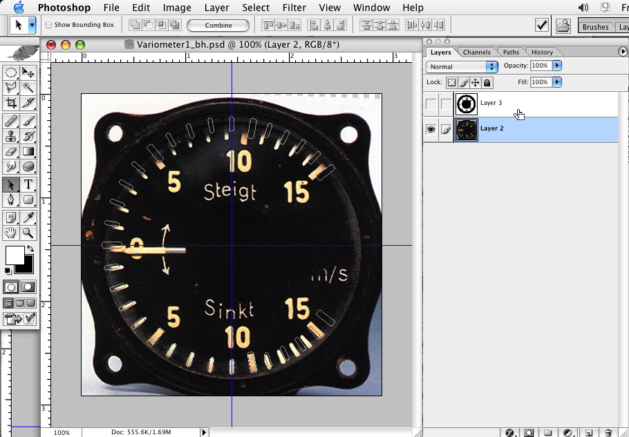
Starting with a good image, make sure it is centered and roughly squared up.
Finding good images can be tough. This one isn't 100% square or centered but I'll deal with that later.
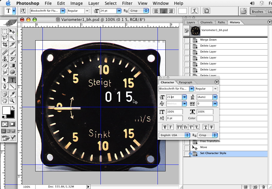
Step 2
Find a font that's close. Type out what numbers or text you'll need. In this case 0, 1 and 5 are all I'll need. Get them roughly sized.
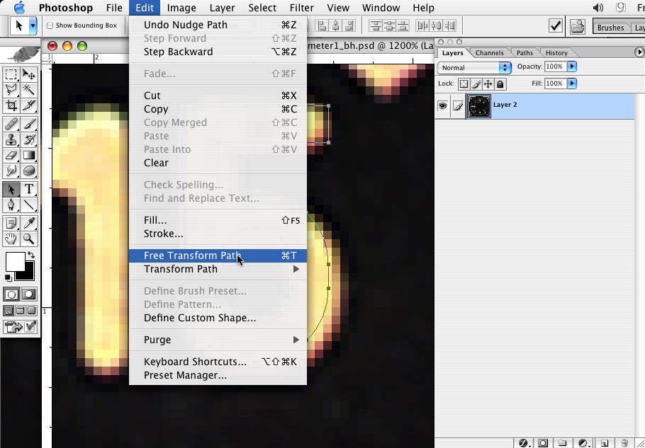
Step 3
Create a work path as shown.
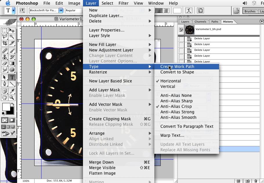
*Note a work path IS NOT permanent, if you've got a work path already on your file and you create another work path, the new path will replace your old path. This can be very bad for you if you've spent a lot of time modifying the path only to lose it :P REMEMBER to save the paths by naming them as you go. You do have history but if you've done this without realizing it your history might have gone past the point of return.
Step 4
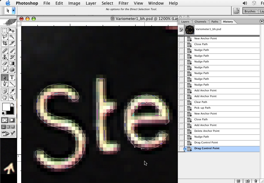
Now that you have your paths to work with you can eliminate your font layer and start sizing and modifying the character.
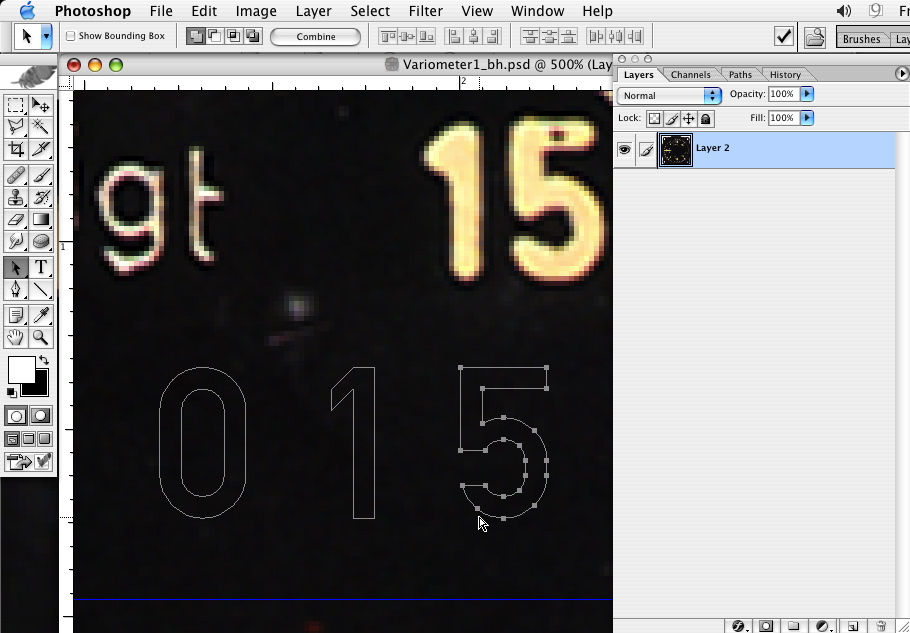


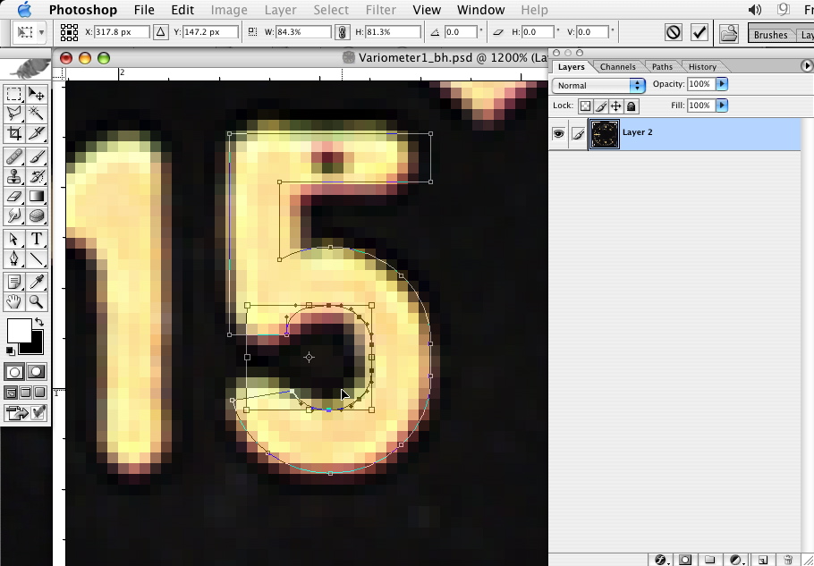
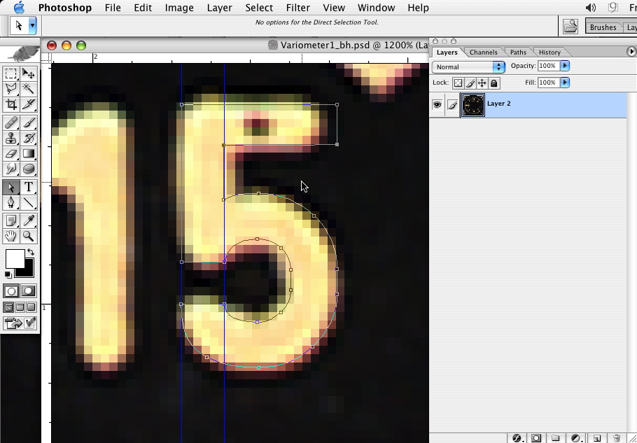

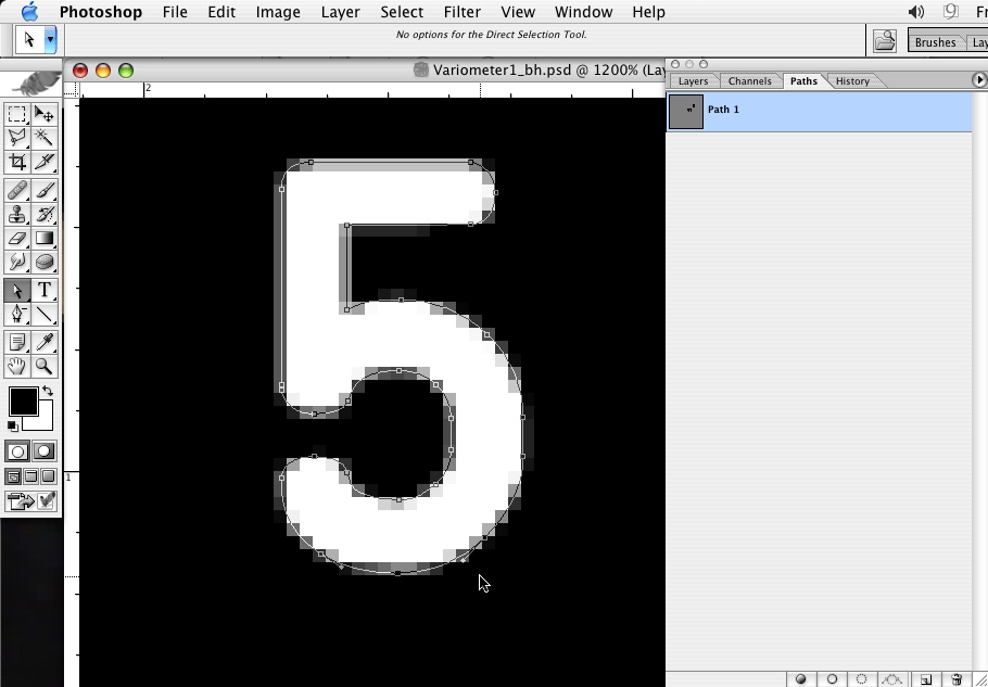
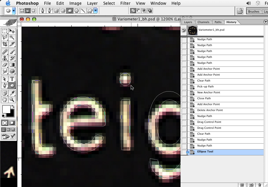
Using whatever methods needed, get the path as close as you want. You can get really crazy here. I feel close is good enough, so long as it retains the general feeling of the real gauge.
Keep in mind that you may want you letters or numbers a bit thicker than they are in your photograph, you don't want them to disappear. You'll develop a feeling for this as you go.
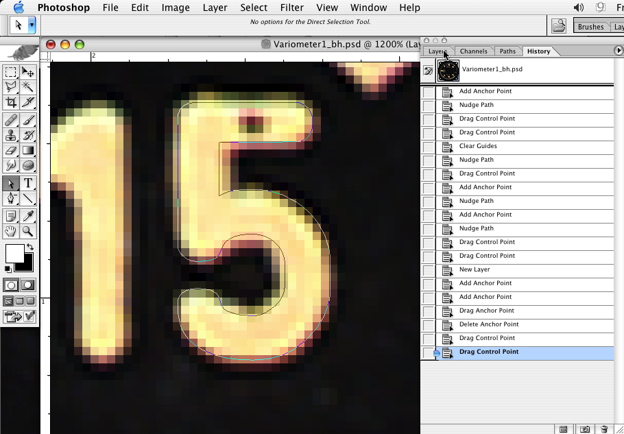
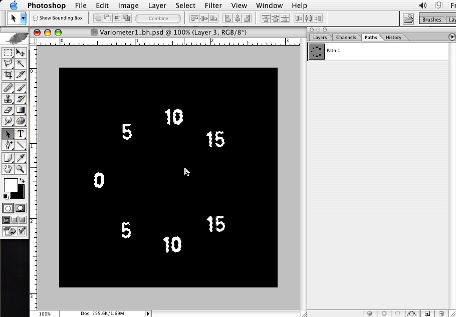
You might want to check your progress as you go by filling the paths on a new layer. Here is what I've got so far-
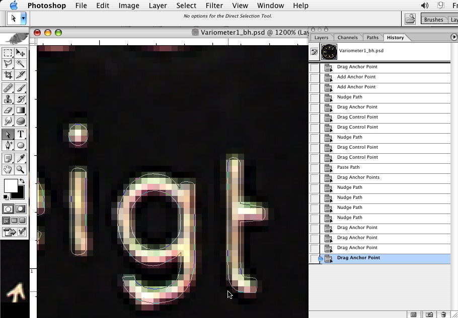
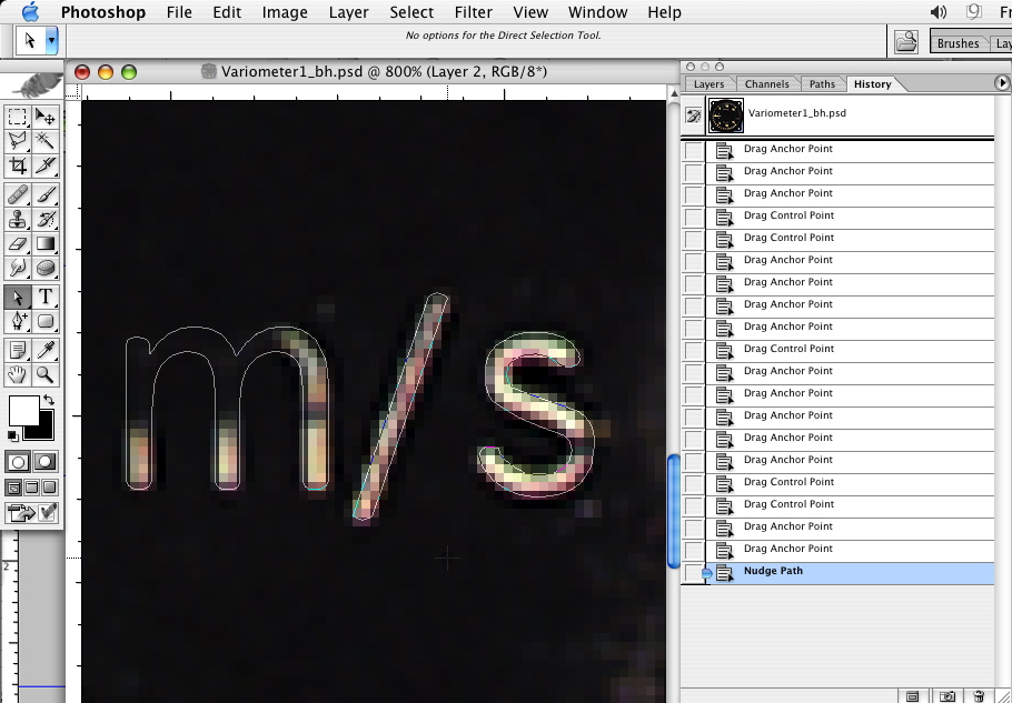
Do the same for the rest of the numbers. Copy and paste as you go. Remember to select all the points before you copy or to use the black path selection pointer.
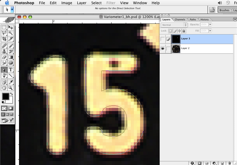
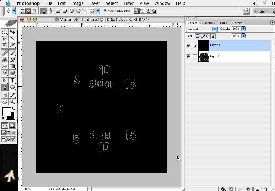
All numbers in place-
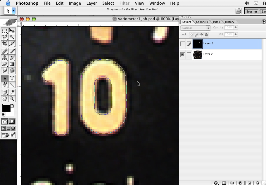
And a check of all the numbers-
Step 5
Now, the lettering, same as above-
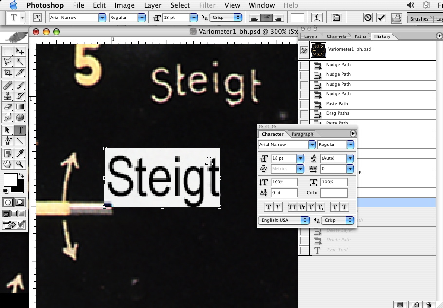
In this case some of the lettering can be reused, but a few new letters are needed.
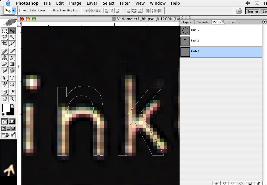
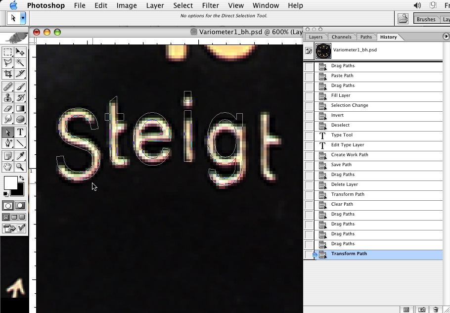
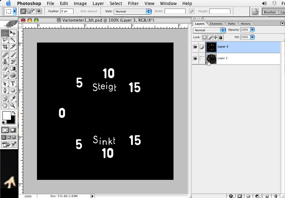
The paths so far-
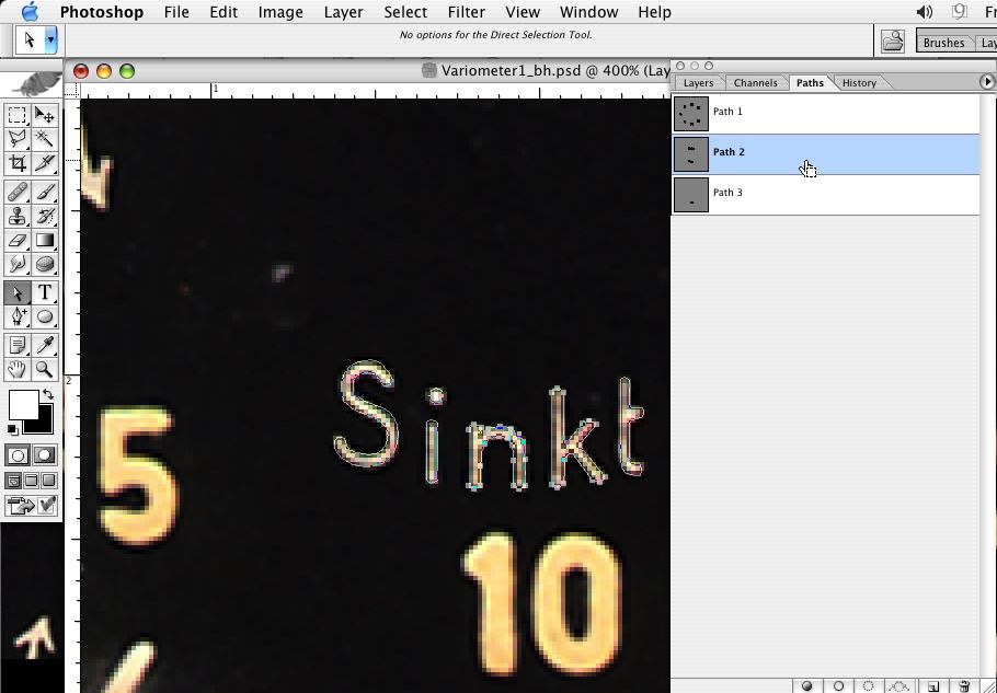
And a check-
Step 6
Using the shape tool set to paths in the tool presets, I've created the ticks using the same methods Adlabs uses. However, these are NOT symmetrical ticks, they contract a bit as the numbers get higher. I use my Mk.1 eyeball but I'm sure some tricky math could be employed.
And a check of the progress-
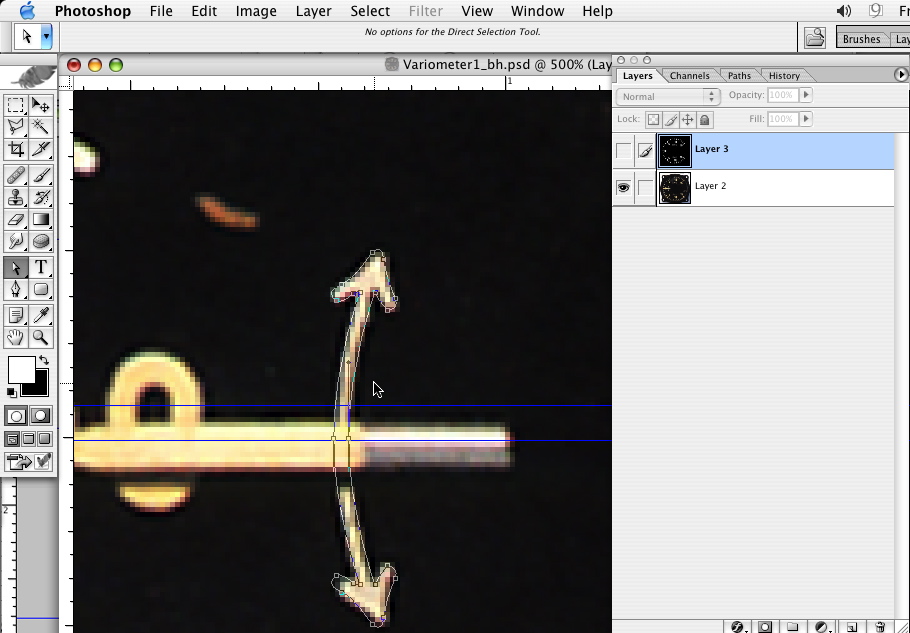
Now the curved arrow, drawn free hand, but using the same principles.
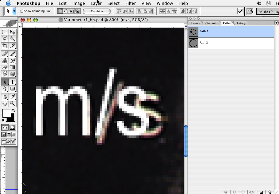
And the "m/s" -
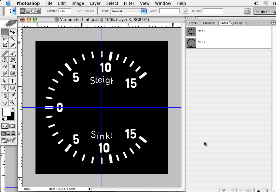
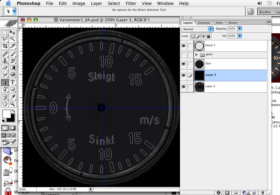
All together-

A few adjustments to placement and another check to make sure everything is squared up and evened out-
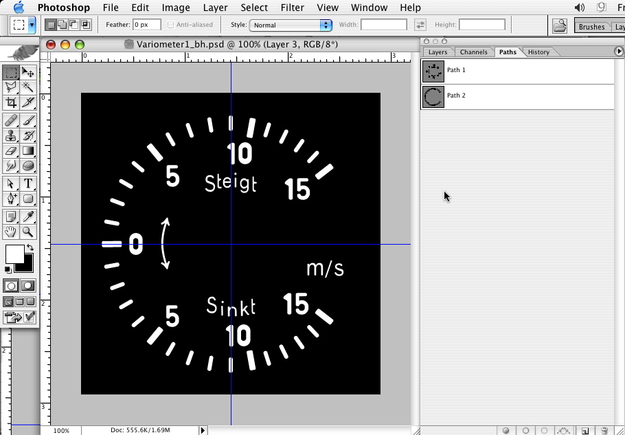
Now with the bezel art and blank dial face, paths only-
Step 7
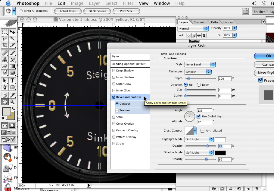
Use the path to fill all your markings in appropriate colors on a new layer. I like to add a bit of noise to them as well.
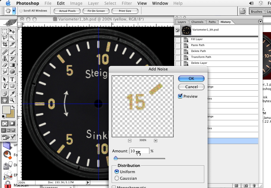
On this one yellowed markings are most likely some sort of glow in the dark paint. The paint looks really thick and built up so I put some 3D effects on them.
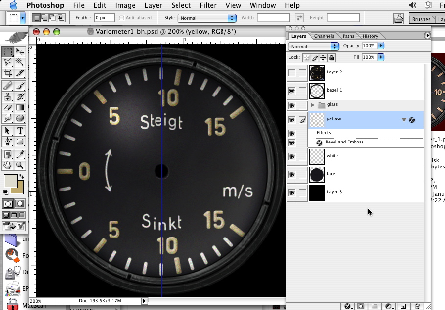
The finished version with glass effects.
You can use these same techniques to create any unusual letters and numbers. You can now have all you fonts ant letters on one easy to manage path and arrange them on layers however they are needed. Also, the paths can be enlarged to any size without loss of detail.
It looks like a lot of work, and it is. But if you want to do it right, you need to do the extra work.
This method, using paths as Adlabs shows in his gauge tutorial has been discussed on the Targetware forum. Several people swear that Illustrator is better for doing this. I feel there are no benefits to using Illustrator in this case other than if you are more comfortable using Illustrator over Photoshop. The end result will need to be in a paint application at least by the time you are ready to render the finished version. I would rather use just the one application from start to finish.
 Section Widget
