


 Reply With Quote
ABSOLUTELY FANTASTIC!!!!! It looks ready to go on a plastic kit box!!!
A "ghost" rider might be fun! Looking forward to seeing the rider on this one.

 Forum Guy

Yea, I've considered color noise not only on the tires, but on some of the large solid areas of the engine block, too.
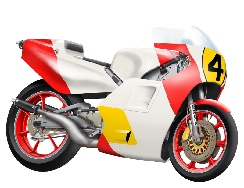
Ok, I've got the fairings done. Up first, the basic exterior.
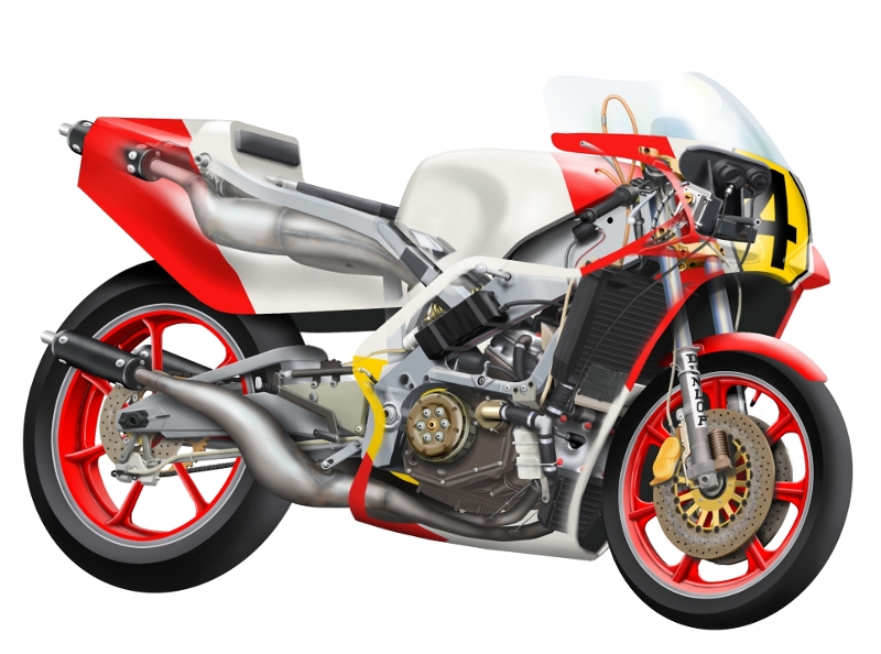
And now a try at a "see thru" effect. This is actually better looking than I had imagined. Still a few areas that need a fix for aesthetics. But aside from a few sponsors on the rear fairing and fuel tank, there is not much left.
Oh yea, I forgot the driver! Would it be too weird to have a partially see-thru driver?
Grand Wazoo
ABSOLUTELY FANTASTIC!!!!! It looks ready to go on a plastic kit box!!!
A "ghost" rider might be fun! Looking forward to seeing the rider on this one.
FAST AND BULBOUS!
Forum Guy
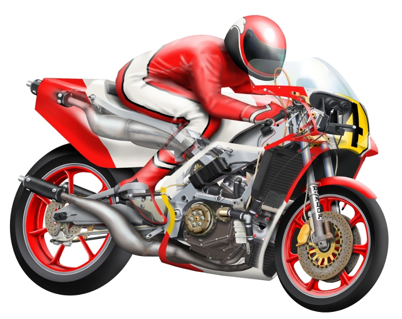
Ok, well here's the first layout with a rider. I think I like it. Some things I might "tune" as I go. He still needs his duct tape knee pads.
This coming weekend I'll work some on the sponsor decals.
Senior Member
Fantastic!
Grand Wazoo
That is pretty fantastic!!!
I like the see through boot!
FAST AND BULBOUS!
Forum Guy
Thanks guys.
Good point Blowhard. A few smaller folds would add to the effect. I need to double check my photo sources, as I recall the suit worn in the photos (taken in 1983) seemed pretty thick, so I don't want to risk going too small with the folds (or at least use them sparingly). That might make the suit look thinner than it appears to be.
The driver needs a few subtle touch ups. I don't like the far arm. The suit needs a couple of seams added, and I need to work in the glove fingers (this will be mostly hidden, though). He needs some work around the collar area, too, I think. The fuel tank also needs a new shader that accounts for the shadow of the rider. This should help visually blend him into the scene.
The see thru boot works OK. I used the same effect on the glove, too.
For the final art, I'm going to reinforce the opacity of the upper exhausts. They are a bit too faded for my tastes. Their edge feathering will stay the same, though. I also want to add a slight edge highlight to the near windshield corner. This should help push the driver back, and bring the cowl forward slightly.
At this point, I think I'm going to leave it on a white background. The road will probably be an artistic type of line, perhaps with a touch of texture along the upper edge, and a rougher brush like stroke on the lower edge. Signature will fit beneath the line.
I'm trying to imagine a print of this as I work. The resolution is a bit low, but a couple of 100% crops at 16x20 size on a 4x6 test print actually look better than I thought. The file resolution is 2301x1788 pixels.
Grand Wazoo
Just to clarify, I didn't mean smaller, just some variation between soft rounded edges and hard sharper edges.
But now looking at GP leathers I'm seeing a lot of different looks on these things.
http://www.motorcyclenews.com/upload...0-dutch-gp.jpg
http://www.ultimatemotorcycling.com/...lpaper%203.jpg
http://www.mcnews.com.au/motorcycler..._4182_1024.jpg
http://www.ultimatemotorcycling.com/...lpaper%203.jpg
http://bikeglam.com/wp-content/uploa...-racing-09.jpg
http://www.wemotor.com/blog/wp-conte...n-Jerez-01.jpg
http://www.hotcarszone.com/wp-conten...released-1.jpg
Lots of different looks caused by different designs and materials!
I guess you need to stick with your photo reference and not listen to me
Almost forgot, I like the white background, and maybe an a nice shadow like in this photo?
http://www.hotcarszone.com/wp-conten...released-1.jpg
FAST AND BULBOUS!
Forum Guy
Yep, there are a lot of looks there. You know what I see as a common element in your pics and the few I have? The folds often have a more pronounced angular form, from wide to narrow, along the length of many of the folds.
Looking at my art, you can see that the folds are mostly the same thickness through their length. I'm thinking I'll try repainting all the folds, perhaps deliberately painting the first stroke too wide, then following up with a second erasing stroke to create the angular effect. Using the eraser along a large brush feather should also help create the look you are talking about, regarding the hard and soft edge mixes.
Thinking about it, I will also try to paint my fold highlights and shadows on separate layers. This way I can have more room to work with shaping the folds without bumping into other nearby stuff. Worst case would be having to do a layer for each fold, where things get tight. My latest XCF file is still very light though, so it's possible.
EDIT: I also notice that in almost every one of those photos, the wheel spokes are blurred. Hmm.
Last edited by adlabs6; 21st April 2012 at 08:48.
Grand Wazoo
That is an interesting idea, maybe to the cut-away as static and one in motion.the wheel spokes are blurred
FAST AND BULBOUS!
Forum Guy
I'm going to explore the wheel blur last, so I can see how it fits the finished image.
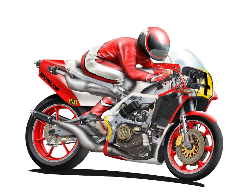
Here is a rider with all new wrinkles drawn. I only kept the boots from the first attempt, as I liked them as they were. The driver's fingers and collar are now drawn, as is the duct tape knee pad. Also competed stuff like the corner shine on the windshield, tweaking the interior transparency details, drivers shadow on the fuel tank, etc.
The first couple of sponsor logos are placed, and I've got an experimental ground line drawn.
 Posting Permissions


