


 Reply With Quote
Fantastic work, Dave! I prefer the black version, whatever the real colour should be.

 Senior Member

Nice is a good word for most work around here. Not these, deserves more superlatives.Originally Posted by BLOWHARD

Historically correct or not, this is my favorite yet, love the detail of the open forward inspection hatch.
Not that I dont enjoy these, but are you working on anything that we haven't seen here, Dave?
BTW. I also noticed the detail that pkassak has pointed out, its...curious, but transposing B&W to colour regularly does my head in, so I'll pass on this one!
Senior Member
Fantastic work, Dave! I prefer the black version, whatever the real colour should be.
Grand Wazoo
Crap! I posted yesterday...I thoughtJust can't do the important things like posting here when I'm at work
I'll post what I thought I said again tonight
FAST AND BULBOUS!
Grand Wazoo
OK, here's what I thought I posted...
Nope, what you see here is what you get. I've got a number of Zeros I never posted here but they start looking the same after a whileNot that I dont enjoy these, but are you working on anything that we haven't seen here, Dave?
Sorry, I work VERY slowly
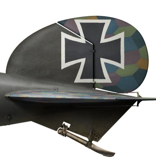
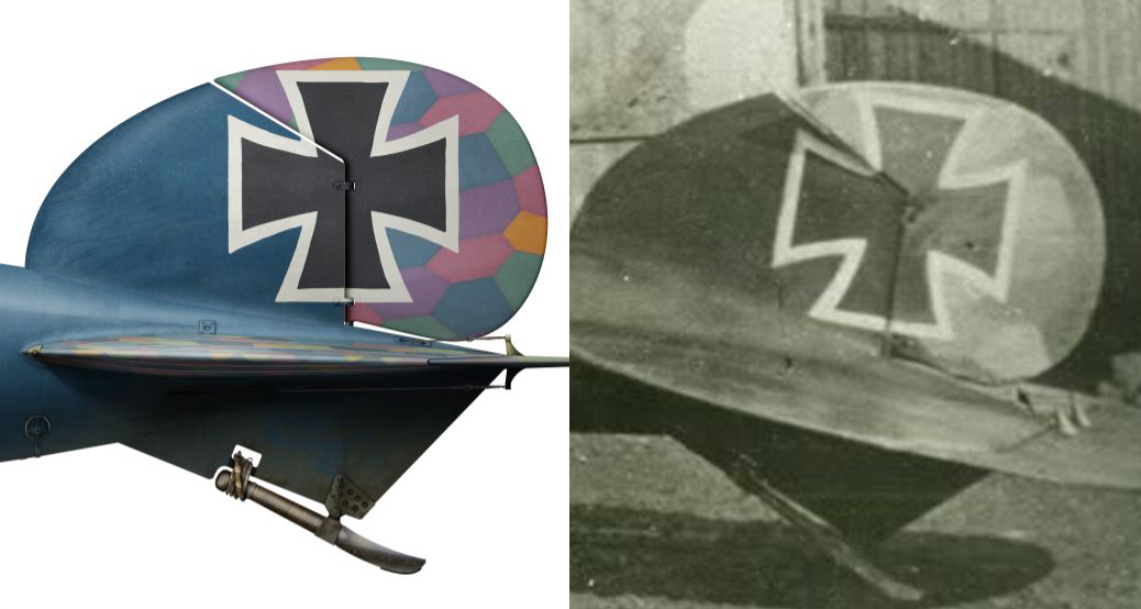
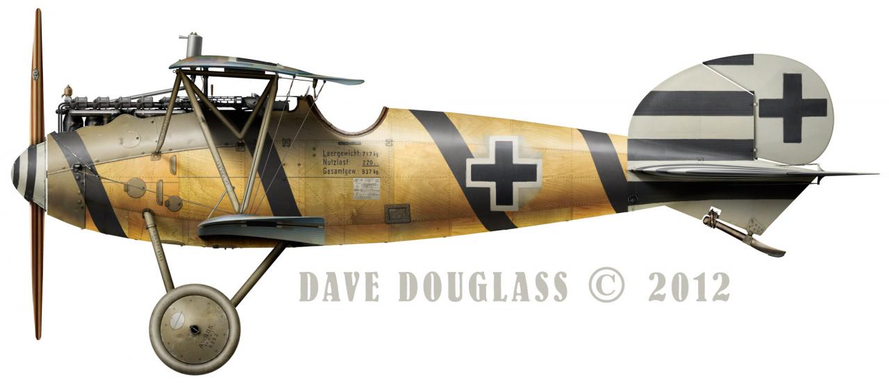
You've got good eyes for detail Peter, most people don't even notice this stuff! You too GFR!but are you sure you have the colors of the chips on the tail camo correct ? seems on thoto that e.g. lower right of the cross there is one that is much light, but you have on that spot rather dark blue...may due to old photomaterial , but I am not sure whether it was applicable on blue (i know of red looked different)
I worked pretty hard to get the pattern to line up. That repeat pattern is the way you determine the orientation of the fabric. I had noticed the weird inconsistencies in the light polygons. I even double checked my colors. On top of that, I thought maybe it was really the darker upper pattern and not the lower. It's usually depicted as the lower pattern because it's so light. But as you can see...
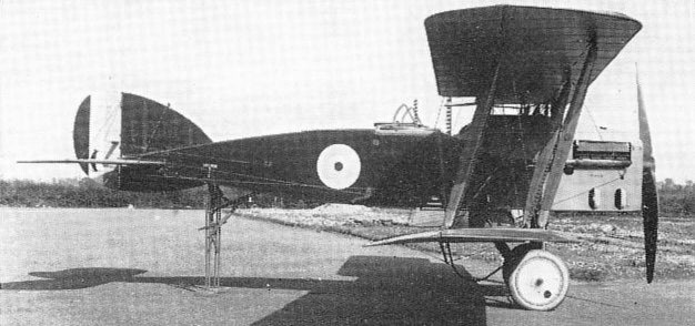
My best guess is that it's the orthochromatic film effect. A lot of photos of British planes show that rich blue on the roundels and rudder flash as light or even white. Look here-
Of course we know it's blue but is sure does seem like it was a light gray.
you'll notice the light patches are both blue-ish on the color fabric.
Maybe that's it? It's the only explanation I have.
Plus, mine at least has the pattern right

Last edited by BLOWHARD; 1st June 2012 at 04:59.
FAST AND BULBOUS!
Senior Member
ortochromatic film made tricks (JG 300 RV bands for example at LW photos), that was my explanation as well
Peter Kassak
Senior Member
I made this pic for a friend to show him why the light colour in b/w (ortho) pics should be the mauve and the dark one the green,
a feature still today mispresented in profiling and modelling, but kind of fits the situation here too...

Find my skins at:www.lowengrin.com
Senior Member
Yeah...I've seen 'em on Bertrands sale site.
I understand perfectly I have at least 2 dozen P-51's in various states of completeness that I have never put up here,
the only problem is that I am constantly re-working(fixing screw-ups to be precise) the base image, necessitating the scrapping of all the come before it.
Anyway...Enough about me.
This thread has taken an interesting turn, orthochromatic film effect, a new term for me.
Grand Wazoo
Yeah, that too! I guess you can never have too much information or do too much checking and rechecking when you deal with B&W images!!!ortochromatic film made tricks (JG 300 RV bands for example at LW photos), that was my explanation as well
Nice Elephant, that's a good comparison!
One other thing to remember, it seems like the amount of light and how strong the light is determines how much color shifting there is between blues and yellow, and other colors for that matter. And then there are colored filters used during printing too, that has another effect. It's a mess. There was a guy on the Aerodrome who claimed a friend of his had all the necessary film information to determine, without a doubt, any color from WW1 B&W film. I challenged him several times to explain how he could factor in the exact temperature of the light on that day, and whether of not any filters were used when taking the photo, developing the print of making the copy print. There seems to me to be a substantial number of variables that would make any study, no matter how scientific, a guess at best.
Same here, although it's more discovering something different on every plane I do.I am constantly re-working(fixing screw-ups to be precise) the base image, necessitating the scrapping of all the come before it
FAST AND BULBOUS!
Grand Wazoo
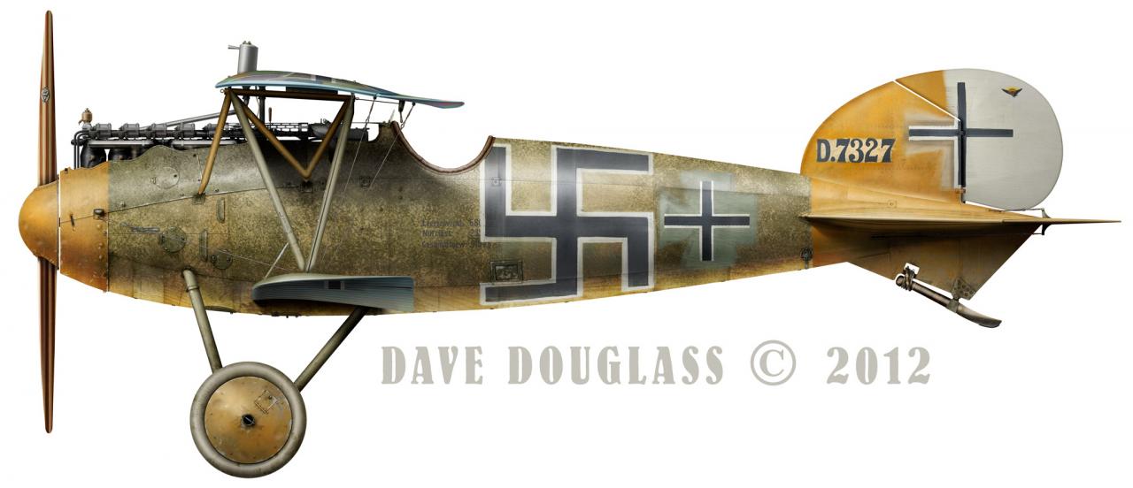
Back to the D.Va again...
I got a some super clear images of 7327 and had to update-
Just now I notice I have a bit more to fix
I'm just now getting around to the OAW built D.Va, LOTS of little differences! I think some of the plywood panels and brad lines are different too but I'm still tracking that stuff down.
Aside for a few picky little things and stuff that doesn't seem to have ever been noticed in drawings or art up to now, this one is about done.
Jasta 73 even though many people think it's Jasta 4...and it DOES look just like Jasta 4
FAST AND BULBOUS!
Senior Member
Oh great! I was looking again that amazing close up you've posted of the MFJ machine, yesterday...
Apparently you missed something on that OAW machine...
The lifting handle was entirely different.
Remember I was trying to read the stencil, but couldnt find a better photo?
Conventionally it should read: Hier anheben ! (Lift here!)
but it doesn't seems so from the photo...so grainy gggrrrr!!!
Another proposal from a friend of mine from Germany and fellow Albatros aficionado is: Hier hochheben ! (Lift up here!)
Jim said he'll look at his archives for a clearer pic, but he didn't came up with anything solid.
Find my skins at:www.lowengrin.com
 Posting Permissions


")

