Reply With Quote
Hi Simon
I don't really like using blue tints in the glass as the glass contained no blue. Attached is a white version which I've got set up on another layer which I flip back and forth to check things every now and again.
Cheers
Clint

 Senior Member

Clint, maybe use a blue as base for your glas! Could you please use a white background. Grey is nice, but not really helpful if you print it later on a white paper without the grey background!
Cheers,
Mierenneuker
Hi Simon
I don't really like using blue tints in the glass as the glass contained no blue. Attached is a white version which I've got set up on another layer which I flip back and forth to check things every now and again.
Cheers
Clint
Senior Member
look very nice Clint

Senior Member
Yep, I agree with you on that one. With my profiles I did settle with using subtle blue in the end for the sake of visibility against white - but only on the areas facing away from the "camera". Consider it a sky reflectionOriginally Posted by Clint Mitchell

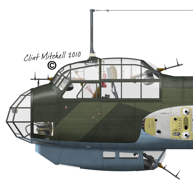
Not overly happy with the effect yet.
Skyraider's 3D Aviation Art - Gallery - Aircraft 8 - Japanese Secret Projects: 2D Profile Illustrations
I think your glass looks pretty decent right now!
Please see Facebook for my latest work: www.facebook.com/aviationart.aero
or visit my aviation art gallery and web store: www.aviationart.aero
Mierenneuker
Thanks Santo!
Nice work Ronnie, I remember these from Military Meshes. They are sure some funky Japanese designs.
Cheers mate
Clint
Mierenneuker
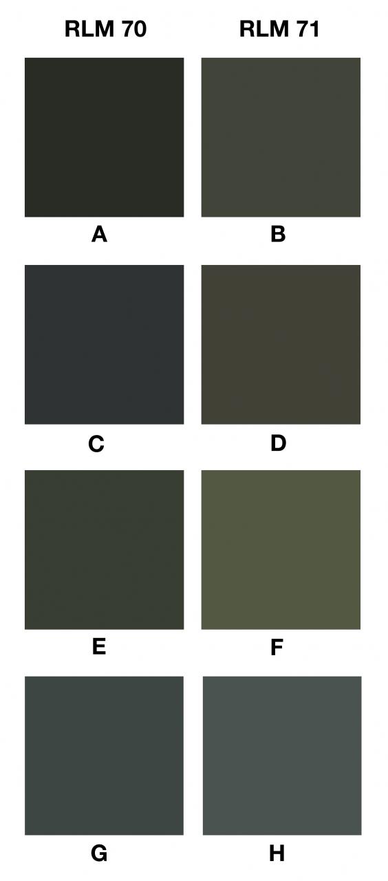
Since John pointed out the RLM 70/71 issue's it's been kind of niggling me.
Attached is a chip set showing the RLM70/71 mixtures I have from different sources:
A+B = Simmers Swatches
C+D = Luftwaffe Camouflage and Markings, 1933-45, Volume 1
E+F = What I'm using at the mo (soon to not be)?
G+H = Sampled from original paint scheme applied to an actual aircraft albeit with 60 years of fading and being underwater?
Comments and ideas on what group or combination you guys think looks right?
Cheers
Clint
Mierenneuker
Might help?
Senior Member
hi clint,
simon should help us out here, he as a way of showing luft colours that even i like, with 70/71 the problem comes as soon as the 71 is applied, it is very unstable very much like olive drab, so as soon as it is applied it starts changing, the older it is the lighter it becomes, when new you can hardly see the difference between the two colours, so throw the ball in the air and where it lands is ok
JMSmith (back by popular demand)
Mierenneuker
Hi John
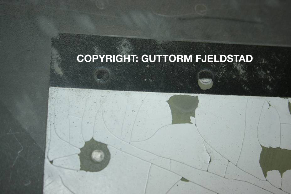
I've seen so many photos showing hardly any contrast and then photos showing a lot of contrast. Maybe new and old aircraft? This is the photo I sampled the original paint scheme from:
By the way the paint under the white by the rivets is RLM02 primer
Cheers
Clint
Senior Member
hi folks!
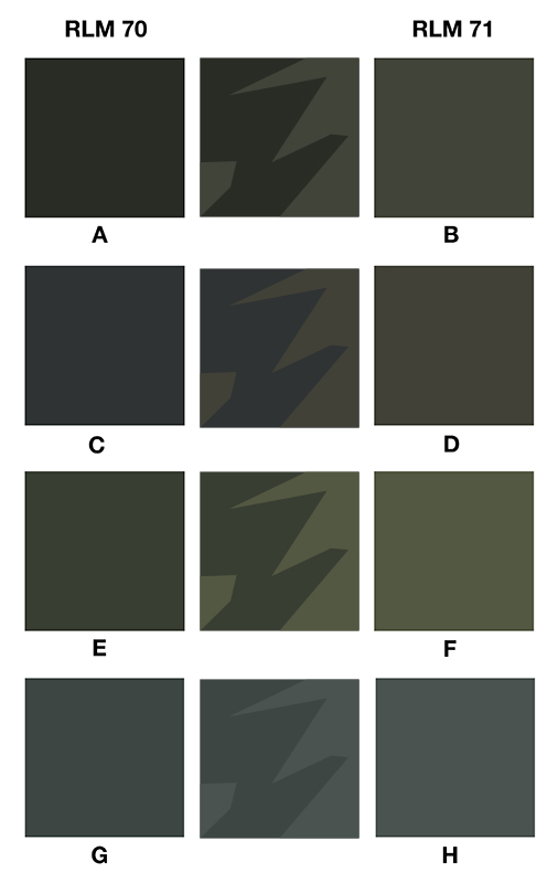
hmm very difficult to say!
C and D were made from the original RLM colour chips but I think the reproduction from the scanner is not really good.
Attached is your colour chart with splitted CMYK and RGB colours. You see that RLM 70(C) is too blue. RLM 71(D) is simply yellow and not green.
Maybe change this two colours to the same colour curve as E and F and lighten them up. E and F look nearly the same I use for these colours.
The problem is that these colours never look like on a finished profile because of really many weathering, lighting and bumping. I think the main impression should fit. If the colour is not 100% correct, don't mind. Who will say that it's not correct? If you print your profile on two different printers it will also look different.
Cheers,
 Posting Permissions